


Academic Case Study
Mobile Photo Editing App (2016)
This case study summarizes the design and development of a mobile photo editing app, launched in 2016 as part of a Master’s thesis in Industrial Design at the University of Tehran, and defended in 2018.
The app was developed by a two-person team:
Sam Miri
Product & Visual Designer
Reza Abdolahi
iOS Developer
At a time when layer-based image editing was not common on smartphones, the app aimed to offer both simplicity and creative control in a mobile-first experience.
It was initially released on the Apple App Store at $2.99, made free after one year, and later removed in 2019.
The entire process followed the Design Thinking methodology, from research to prototype and testing. Visual design and mockups were created using Photoshop and CorelDRAW,
with interactions demonstrated via PowerPoint click-throughs.
This project demonstrates how academic design work can lead to a real-world product, even with minimal resources and tools available at the time.
Introduction
Project Overview
This project focuses on the design and development of a mobile photo editing application, created in 2016 during a time when mobile design tools and technologies were still in their early stages. The project was developed using the Design Thinking methodology, with the aim of creating an intuitive, easy-to-use, yet powerful editing tool tailored to everyday users and aspiring creators.
In 2016, smartphones were widely used for photography, but most available photo editing apps were either too basic or too complex. Layer-based editing, which is now common, was still largely absent from mobile applications. Moreover, AI-assisted features and intelligent filters had not yet become part of mainstream tools, making this app’s concept—focused on balancing simplicity with creative flexibility—significant for its time.
Challenges in the Market (as of 2016)
- Lack of smart editing tools: AI-powered editing and automatic enhancements were not available.
- Limited editing depth: Most apps only offered basic filters and adjustments without much control.
- Overcomplicated interfaces: Existing advanced apps often required technical knowledge.
- No support for layer-based workflow: Users lacked access to structured, non-destructive editing in mobile environments.
These limitations highlighted the need for a photo editing app that was both user-friendly and capable of deeper creative control—all designed with mobile-first interaction in mind.
Why This Project is Important?
Key Reasons for Developing This Application in 2016:
Rising mobile photography culture:Social media platforms like Instagram encouraged mobile photo creation and sharing.
Lack of mid-level editing tools:Users were stuck between extremely simple apps and overly complex ones.
Opportunity for innovation:A gap existed for an app that could offer a better balance of simplicity and flexibility.
Design Thinking as a framework:Applying user-centered methods helped guide features and usability in a way that stood out at the time.
User Research & Problem Definition
Objective
The goal of this phase was to understand how users interacted with existing photo editing apps in 2016, what their pain points were, and how a new mobile-first solution could better serve their needs. This aligned with the Empathize and Define stages of the Design Thinking process.

Research Methods (2016 Context)
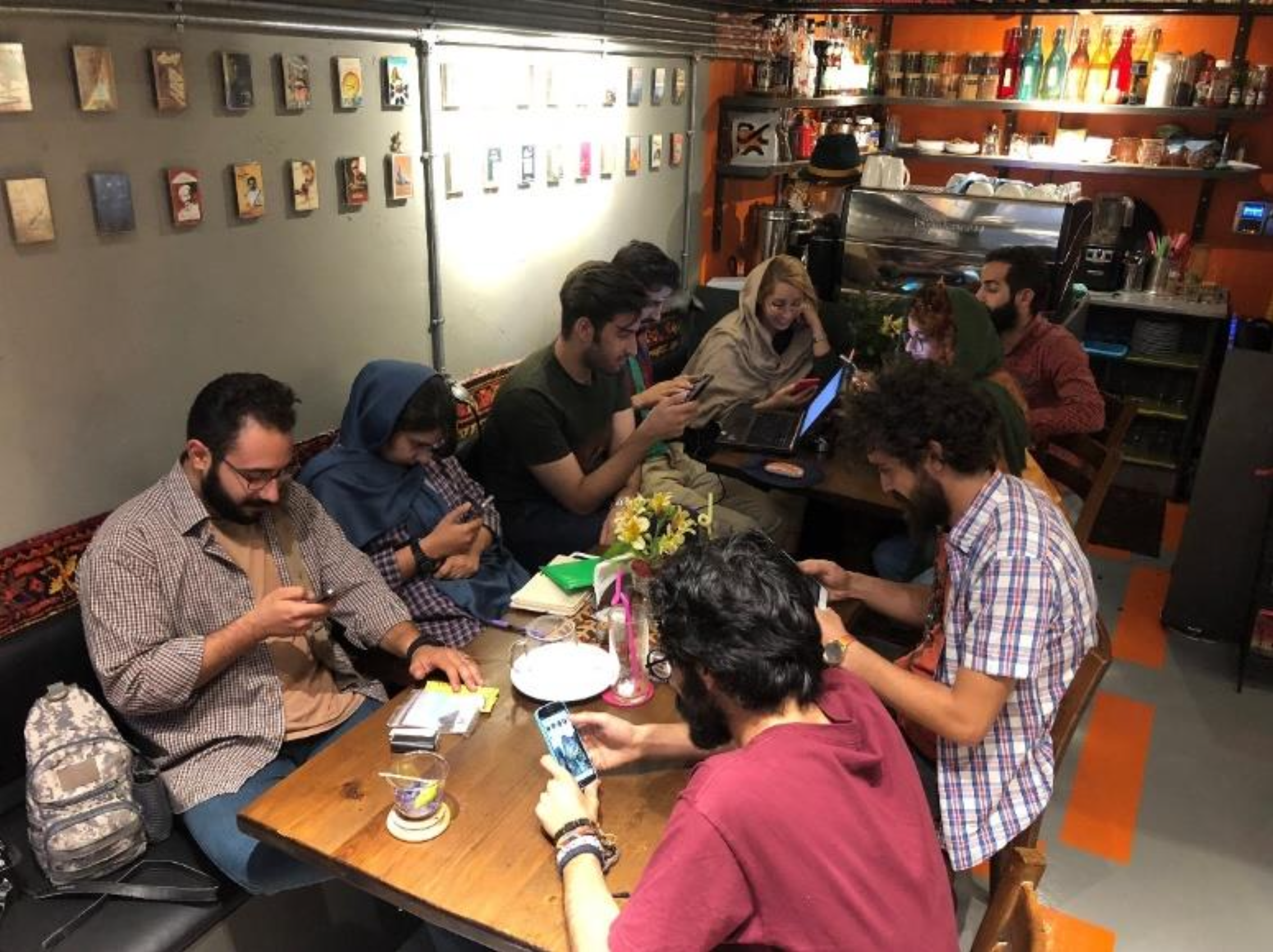
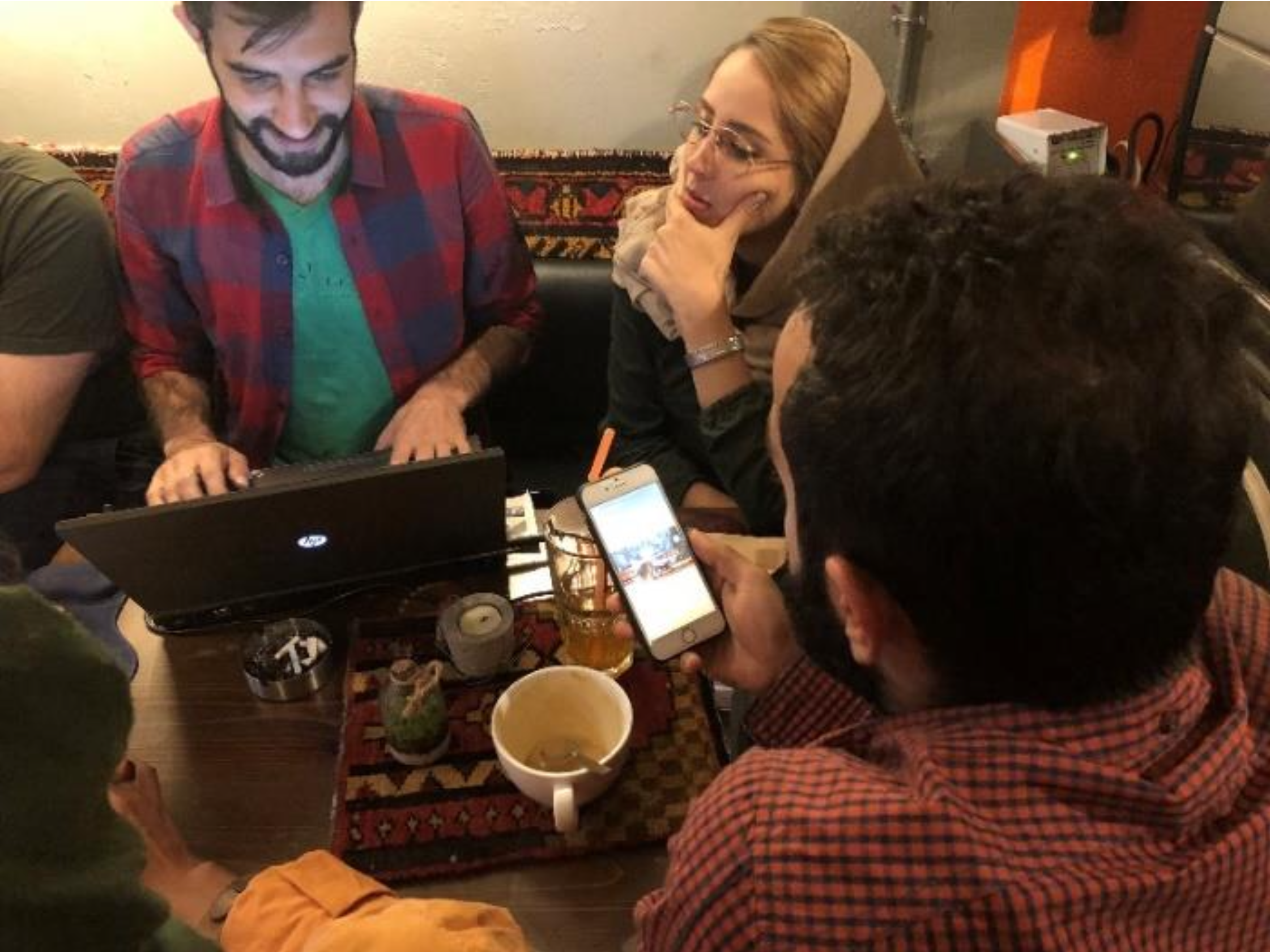
Given the tools and practices available in 2016, user research was conducted using mostly manual and in-person methods, including:
- Printed questionnaires shared among students, photographers, and casual smartphone users
- One-on-one interviews (semi-structured) with a mix of novice and experienced users
- Observations of users editing photos on their mobile phones
- Review of App Store reviews from popular apps like Snapseed, VSCO, and Afterlight
Persona Development Process
The development of user personas followed a multi-stage approach inspired by methods described in the thesis:
- Pilot Personas – Initially, rough personas were outlined based on assumptions and early survey responses. These helped spark early design conversations and guide user interviews.
- Role-Playing Personas – During interviews, participants were asked to walk through scenarios (e.g., “You’ve just taken a photo you want to quickly enhance before posting to Instagram”) to better understand their behavior and preferences.
- Goal-Oriented Personas – Based on interview transcripts and pattern analysis, personas were refined to represent users not just by demographics, but by motivations, frustrations, and editing goals.
- Engaged Personas – Final personas were validated by presenting them back to select participants to verify accuracy. Their feedback confirmed the personas reflected real user types, which then informed design decisions.
User Personas
Two representative user personas were finalized through this iterative process:

Emma (Beginner User)
- Age: 22
- Background: University student, active Instagram user
- Needs: Quick, beautiful photo edits without technical steps
- Goals: Look good on social media, feel creative with minimal effort
- Frustrations: Overwhelmed by complex icons and tools, dislikes multi-step edits

David (Experienced User)
- Age: 34
- Background: Freelance designer, edits photos for client presentations
- Needs: Precision control over exposure, contrast, and color
- Goals: Professional-level results on the go without needing desktop software
- Frustrations: Mobile apps lack structure, too many taps for basic adjustments, no layering tools
Key Insights
- Simplicity was a top priority for most users, especially those unfamiliar with design tools
- Advanced users wanted more control, but still expected speed and usability
- No mobile app offered a balance between simplicity and structured editing
- Layer-based editing was highly desired but not found in mainstream mobile apps at the time
Problem Statement
In 2016, users needed a mobile photo editing app that offered ease of use for beginners and deeper control for experienced users—without relying on desktop workflows or sacrificing usability.
This problem statement guided the design priorities and helped establish a vision for the rest of the project.
Ideation & Concept Development
Objective
The ideation phase aimed to explore a wide range of solutions based on the needs and problems identified during user research. This phase corresponds to the Ideate stage of the Design Thinking process and was carried out using available analog tools and team-based methods appropriate for 2016.
Ideation Process
At the time, the design team used a paper-based and collaborative approach to generate ideas:
- Sketching concepts on paper and whiteboards
- Group brainstorming sessions focused on task-based scenarios
- Card sorting and clustering to organize ideas thematically
- Discussions around user personas (Emma and David) to assess ideas from both beginner and advanced user perspectives
The small team (designer + developer) worked closely to ensure each idea was not only desirable but also technically feasible on iOS devices of the time.
Framing the Design Challenges
Key user needs and frustrations were turned into challenge questions:
- How can we help users like Emma edit photos without getting overwhelmed?
- What features would give David professional-level control on a small screen?
- How can we deliver an editing experience that feels fast and intuitive?
Key Concept Directions
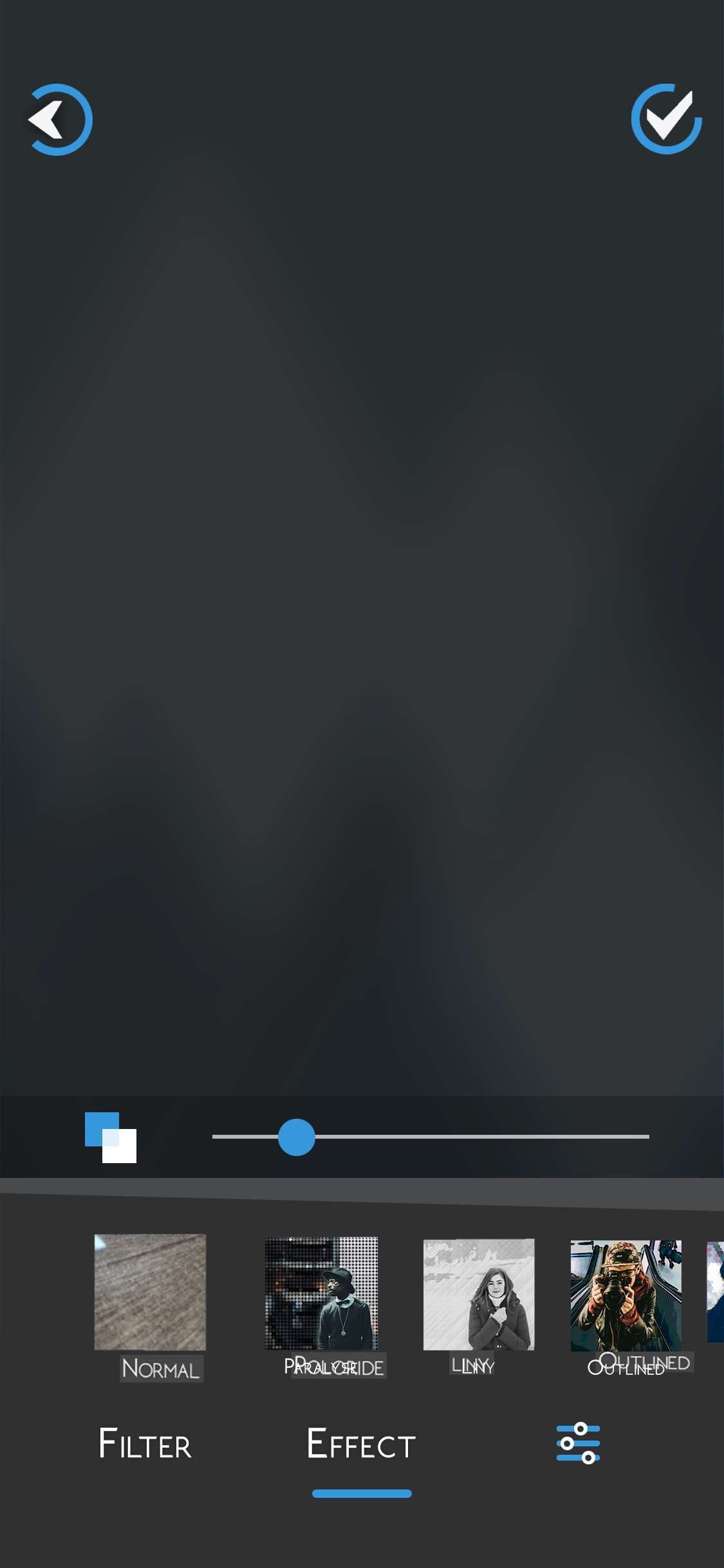
- Two-Level Editing Modes
- Quick Edit Mode: For users like Emma, featuring automatic adjustments and one-tap filters
- Advanced Edit Mode: For users like David, offering sliders for brightness, contrast, color balance, and crop controls
- Non-Destructive Layer-Like Workflow
- Though true layering wasn’t available, the app simulated it by letting users apply effects in order and modify them later
- Minimal Interface with Large Controls
- Simplified UI using icons, toggle buttons, and swipe gestures to streamline navigation
- Preset Library and Favorites
- Allowing users to save their favorite filter combinations and reapply them easily
Prioritization and Selection
After sketching multiple solutions, ideas were evaluated based on:
- Alignment with Emma and David’s goals
- Ease of implementation within the available timeline and tools
- Simplicity and learning curve for first-time users
High-impact ideas were selected for wireframing and early prototype testing.
Prototyping & UI/UX Design
Objective
The goal of this phase was to translate selected concepts into visual and structural designs that could simulate the user experience and be tested for usability. This phase corresponds to the Prototype stage of the Design Thinking process and was conducted using tools and methods available in 2016.
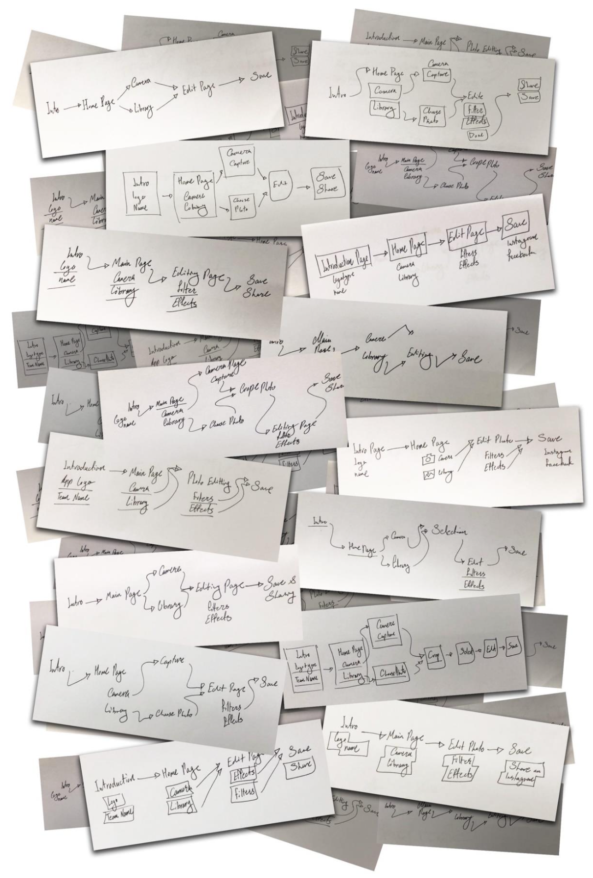
Wireframing
- Hand-drawn wireframes to outline basic screen layouts and interactions
- Adobe Photoshop for mid-fidelity mockups
- CorelDRAW for organizing layout elements and interface structure
Wireframes focused on core flows:
- Selecting an image from camera or gallery
- Applying edits (filters, crop, adjustments)
- Saving and exporting the result
Wireframes were reviewed iteratively between designer and developer, making quick adjustments based on technical limitations and usability assumptions.
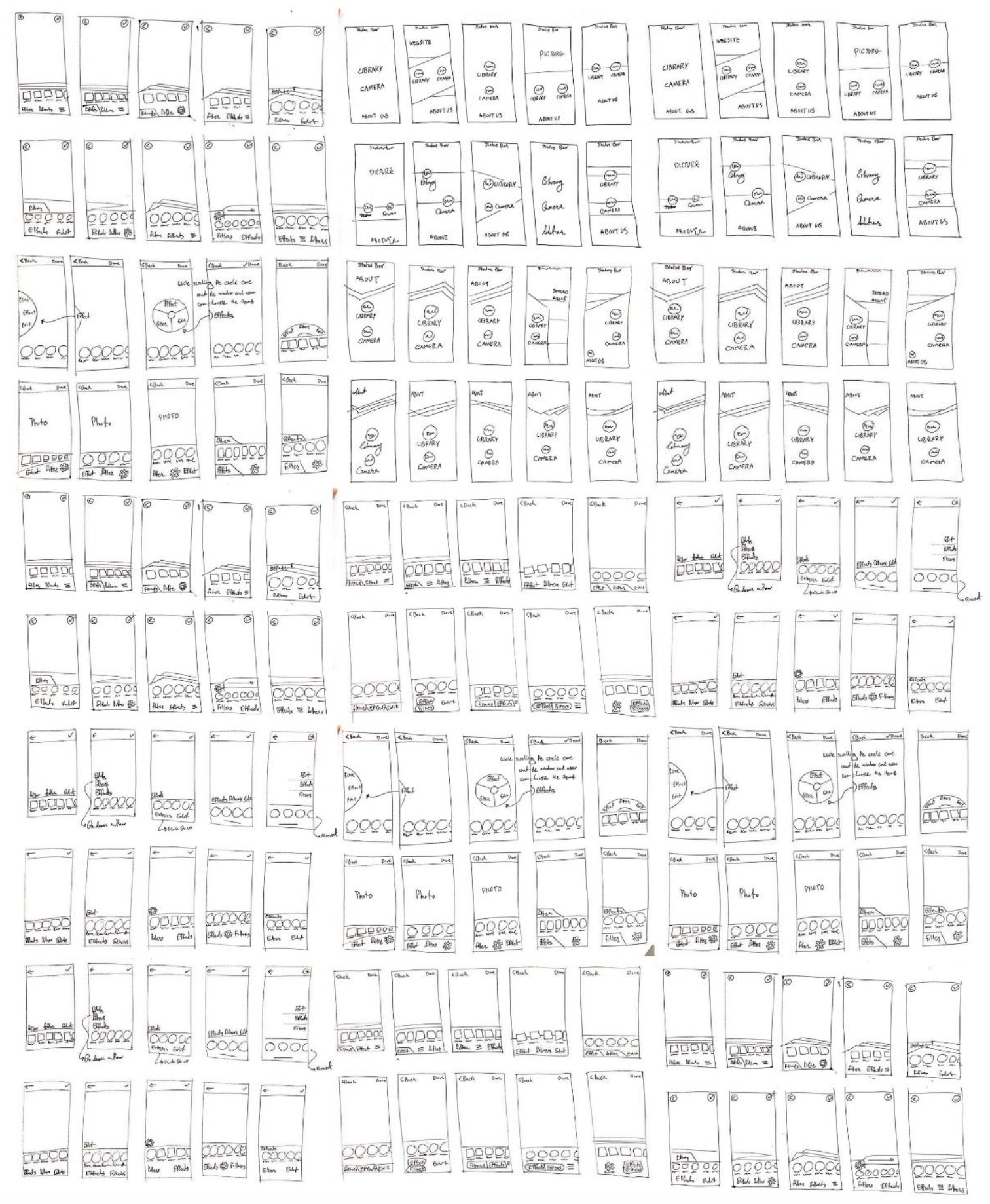
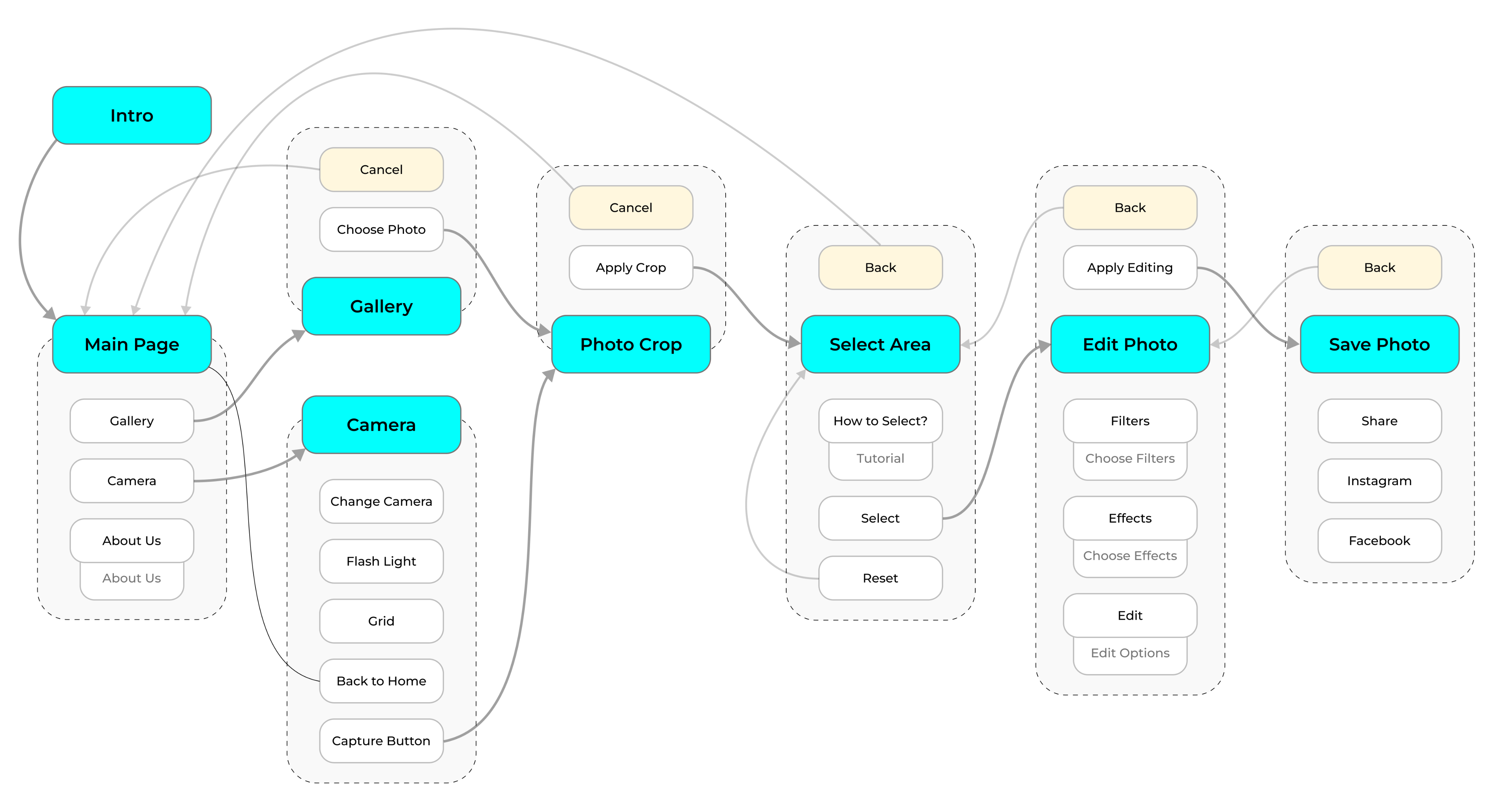
User Flow Design
A clear user flow diagram was created to map the main tasks, from launching the app to completing a photo edit. This included:
- Main screen → Camera/Gallery
- Crop or select area
- Apply edits (filters, adjustments)
- Save or share
The flow emphasized speed, clarity, and simplicity, especially for new users like Emma. Navigation was reduced to a few key screens, with minimal layering to avoid confusion.

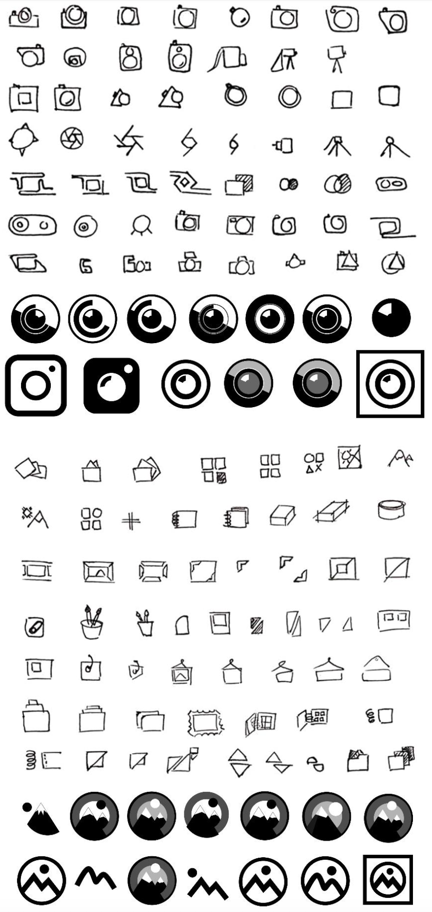
UI Design Considerations
Visual design emphasized:
- Minimal interfaces with clean iconography
- Dark background to enhance focus on images
- Large tap targets for easier interaction on small screens
- Flat visual style popular at the time, avoiding gradients and shadows
All graphical elements — including icons, UI components, and illustrations — were originally designed for this project. No assets were copied or sourced externally. The design was created from scratch to maintain a cohesive and unique visual identity.
Prototype Simulation
Since no interactive prototyping tools like InVision or Figma were in use, interactivity was demonstrated through:
- Sequential Photoshop mockups exported as image slides
- PDF-based click-throughs to simulate navigation flow
- Occasionally, PowerPoint presentations to walk stakeholders through screens
These methods allowed the team to validate the look and logic of the app before implementation.
Usability Testing & Iteration
Objective
The aim of this phase was to evaluate the prototype’s usability and gather feedback from potential users. This corresponds to the Test phase of the Design Thinking process. Testing was conducted with tools and methods suited to 2016’s resource constraints.
Testing Setup
Due to the limited availability of interactive prototyping tools, the team used:
- Printed mockups for task-based walkthroughs
- Slide-based simulations in PDF or PowerPoint format
- In-person usability tests with real users, primarily students and creatives familiar with photo apps
Participants were asked to perform simple tasks such as:
- Selecting a photo
- Applying a filter or edit
- Saving and exiting
Observers recorded usability issues, time to task completion, and user reactions.
Key Findings
- Positive Reaction to Simplicity
- Most users appreciated the clean UI and minimal steps required to complete edits.
- Misunderstood Icons
- A few icons needed redesign as users misinterpreted their function.
- Confusion Around Edit Modes
- Some users were unsure of when they were in quick or advanced editing mode, prompting a clearer visual indicator.
- Desire for Undo/Redo
- Users frequently asked for undo/redo functions, which were added to the feature list.
Iteration Process
Following the feedback:
- Icons were redesigned to improve clarity
- Visual cues (such as header labels and active-state highlights) were added to distinguish edit modes
- The save and export flow was simplified
- Additional tips were embedded for first-time users
Each change was validated through internal reviews and follow-up sessions with a subset of previous testers.
Impact
These iterations significantly improved:
- Task completion time
- User confidence
- Overall satisfaction with the prototype
They also reinforced the value of low-cost, early-stage testing, especially when access to high-fidelity interactive tools is limited.
Implementation & Deployment
Objective
This final phase focused on building a fully functional iOS app based on the validated prototype, preparing it for public release on the Apple App Store.
Development Process
The app was developed in Objective-C, which was the standard language for iOS development at the time. The developer (Reza Abdolahi) worked closely with the designer (Sam Miri) to ensure accurate translation of the UI mockups into a usable interface.
Key Focus Areas:
- Maintaining fidelity to the original design
- Ensuring performance on a range of iPhones available in 2016
- Implementing features like Quick Edit, Advanced Edit, undo/redo, and image export
Version control was managed manually using shared folders and backups, as GitHub integration was not part of the team’s workflow at the time.
App Store Preparation
The team prepared all required assets and documentation for submission:
- App icon and screenshots (designed manually in Photoshop)
- Description and keywords optimized for discoverability
- Privacy policy and support email created to comply with App Store guidelines
The app was submitted and approved for the App Store in 2016, priced at $2.99.
Post-Launch Feedback
After launch, the app received positive feedback for its clean interface and intuitive controls. Key observations included:
- Users praised its speed and simplicity
- Some advanced users requested more manual controls (to be considered for future versions)
Lifecycle Summary
- Year 1: Paid version available at $2.99
- Year 2: App made free to expand reach
- 2019: App retired and removed from App Store

Final Result
Objective
The final result of this project was the successful design, development, and market launch of a mobile photo editing application tailored for iOS. Released in 2016, the app was designed at a time when The concept of simplified, layer-based mobile editing was still emerging.
This project was developed by a two-person team: Sam Miri (designer) and Reza Abdolahi (iOS developer). The application was sold on the Apple App Store for $2.99 during the first year and was later offered for free before being removed in 2019.
Product Launch and Distribution
After testing and revisions, the app was released on the Apple App Store in the United States and other English-speaking markets. The development team ensured all Apple guidelines and legal requirements were met. After launch, one round of updates was released to fix minor issues.
The app was offered as a paid product, initially priced at $1.99 in the U.S. and $2.63 in Canada. Revenue, after tax deductions, was deposited monthly to the developer’s account. Payments were processed via Apple’s system, and users could purchase the app using major credit cards, PayPal, or associated banking accounts. Apple also offered refund options for unsatisfied users.
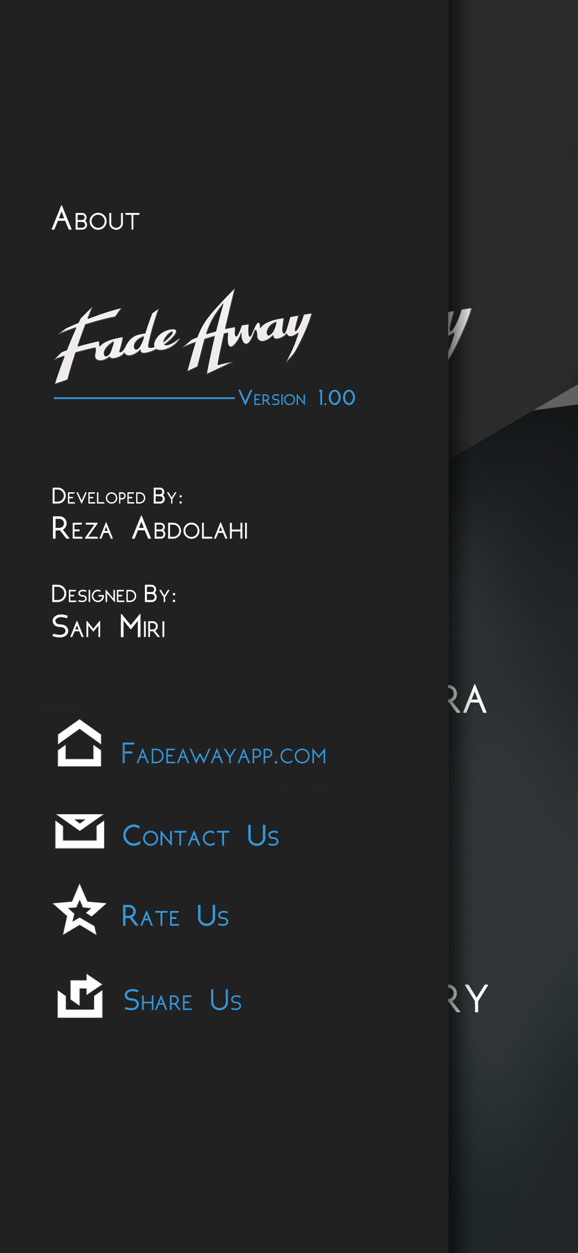
Visual Identity and Contact Points
The final version included custom-designed screens, typography, and interaction elements. Every visual touchpoint with users was developed with consistency in mind:
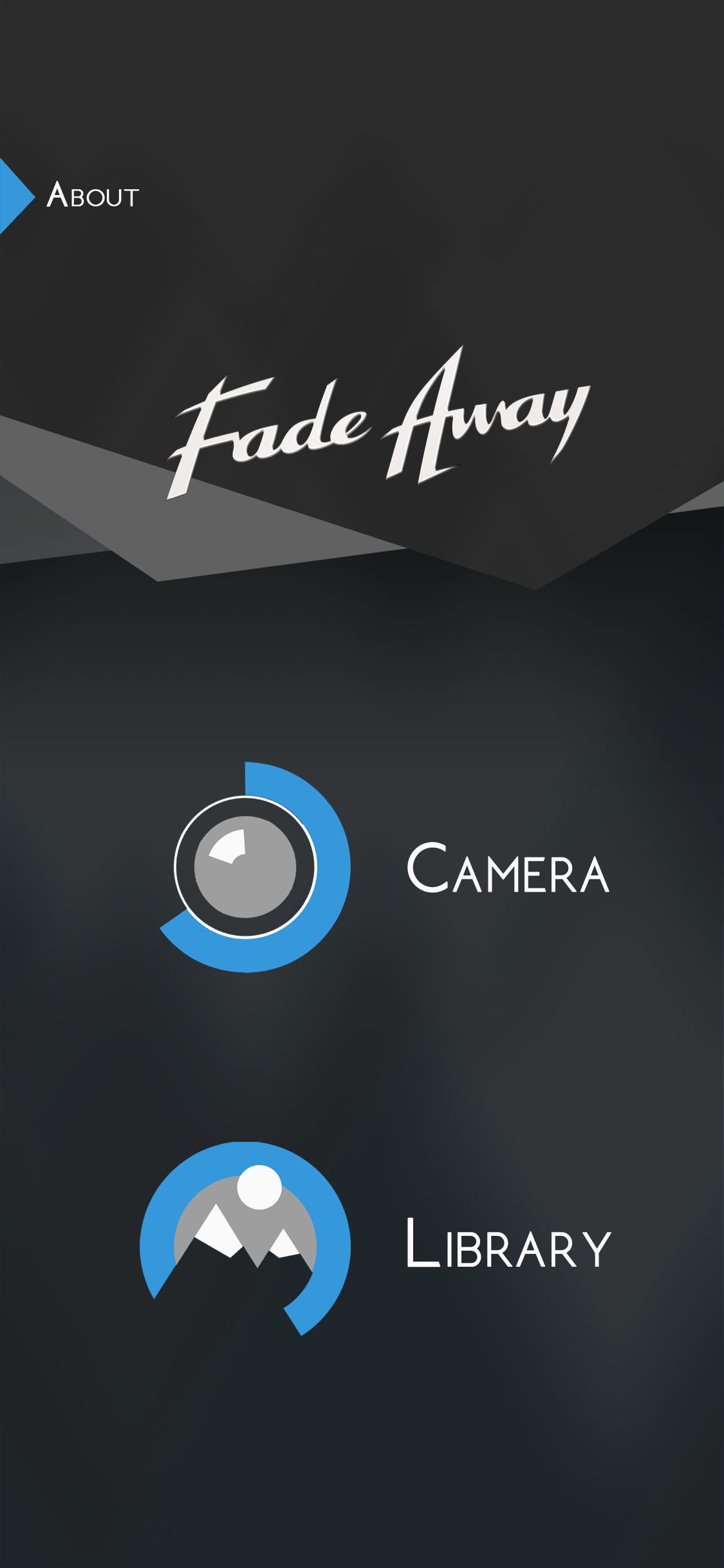
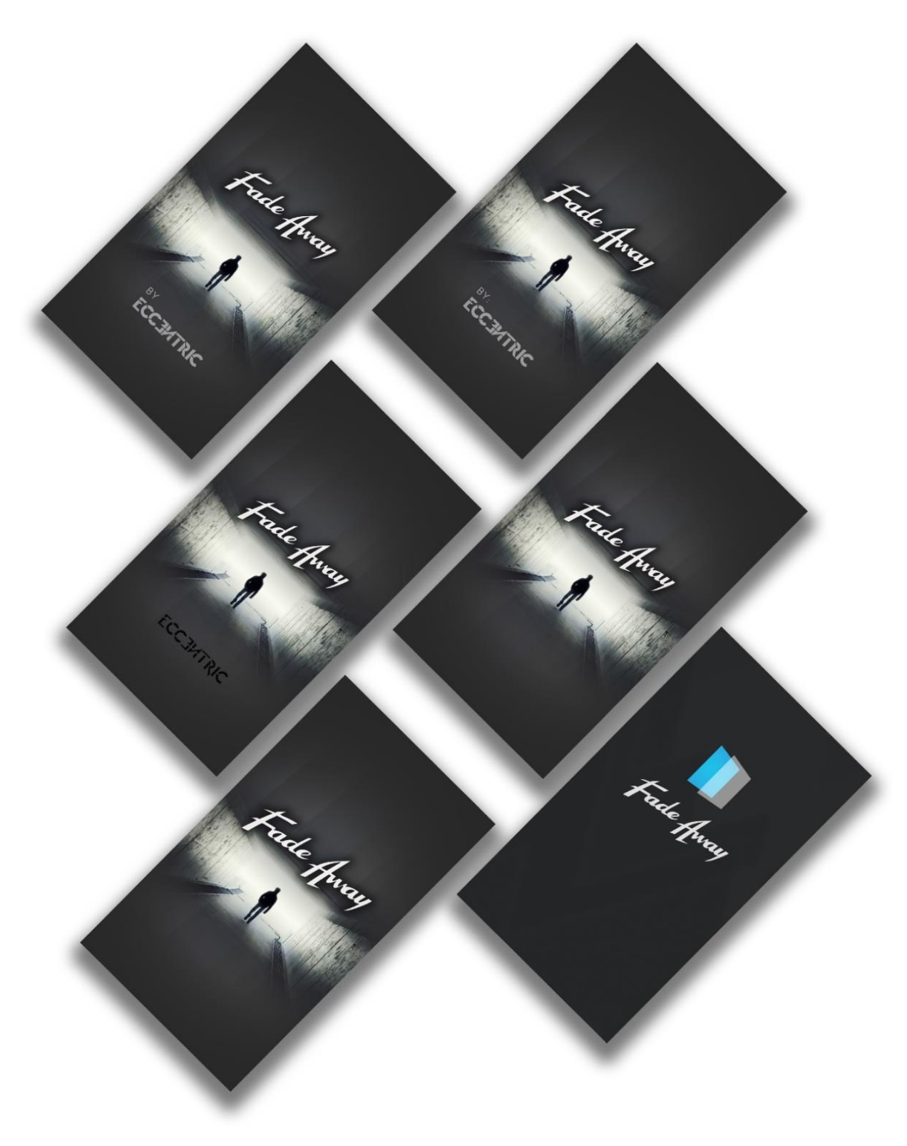
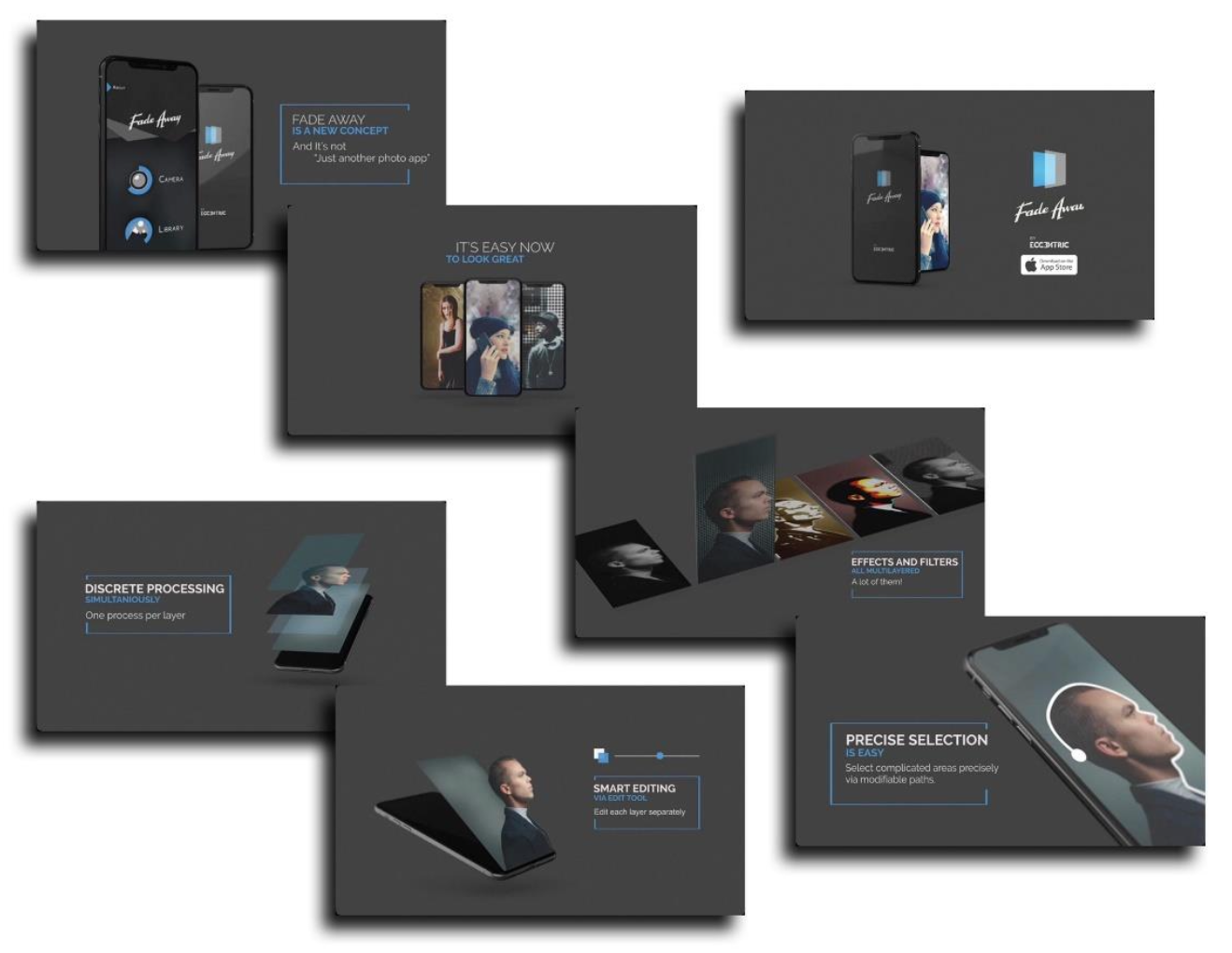
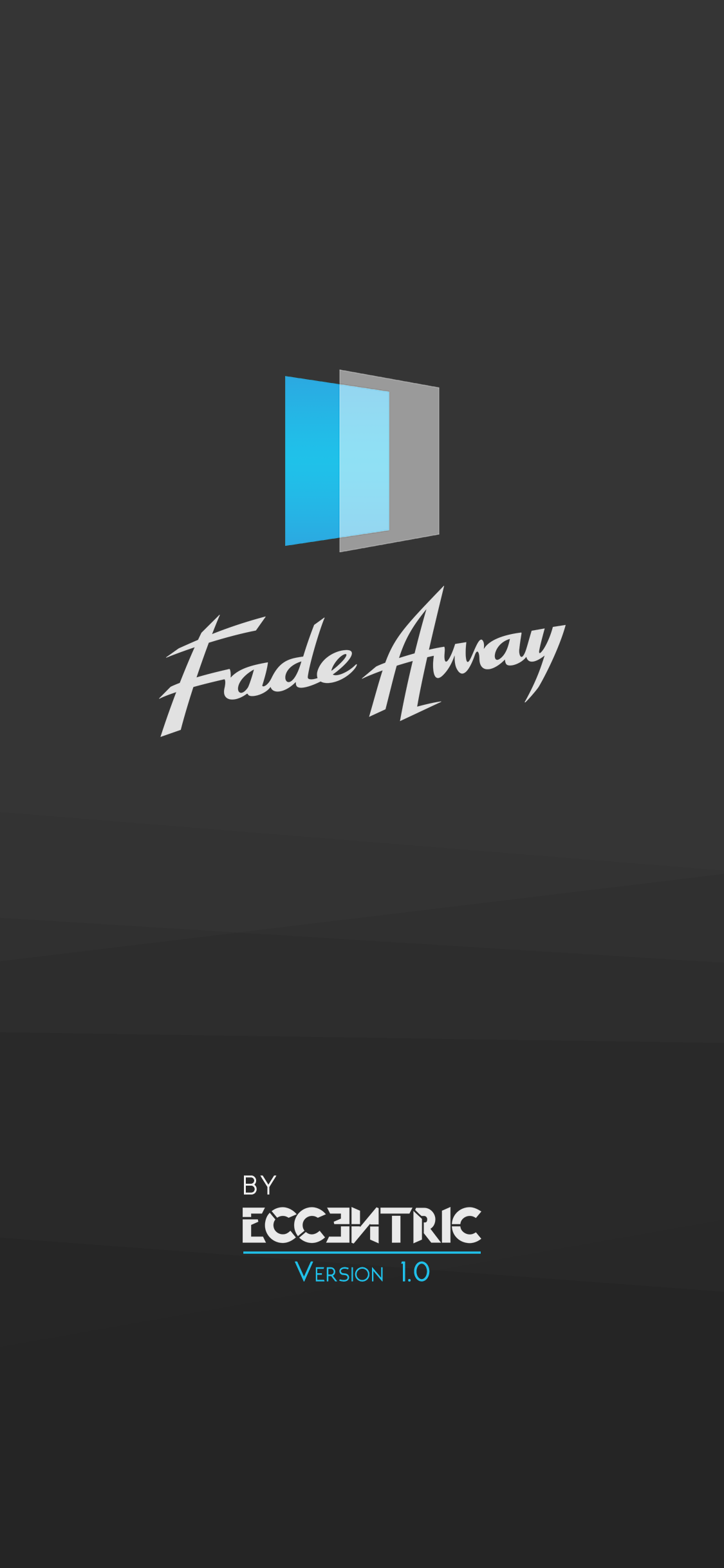
App Name: Fade Away
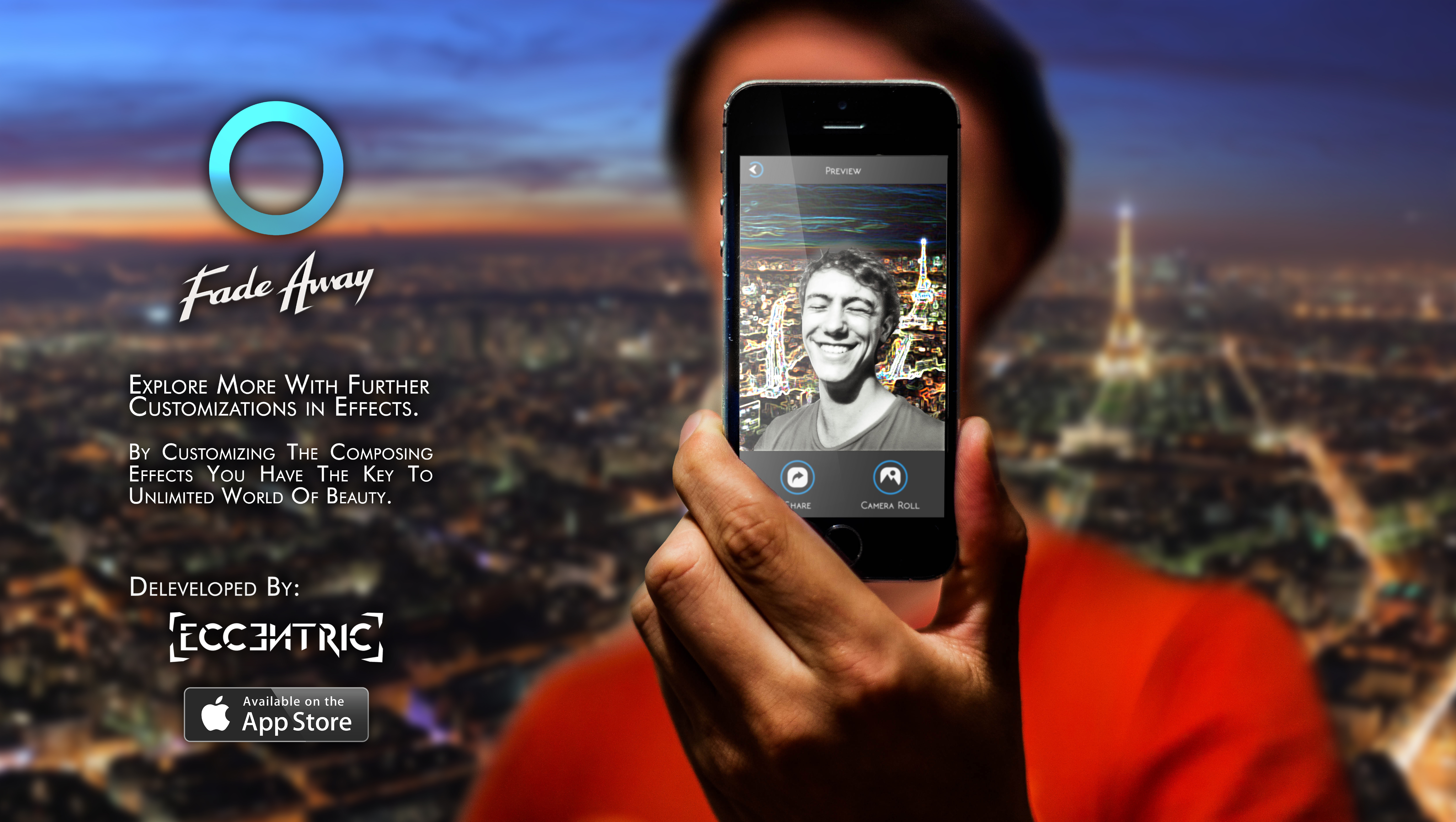
The term “Fade Away” in English combines the ideas of vanishing and fading out. The name metaphorically reflects the core function of the app—visually separating and gradually removing parts of an image through layered editing.
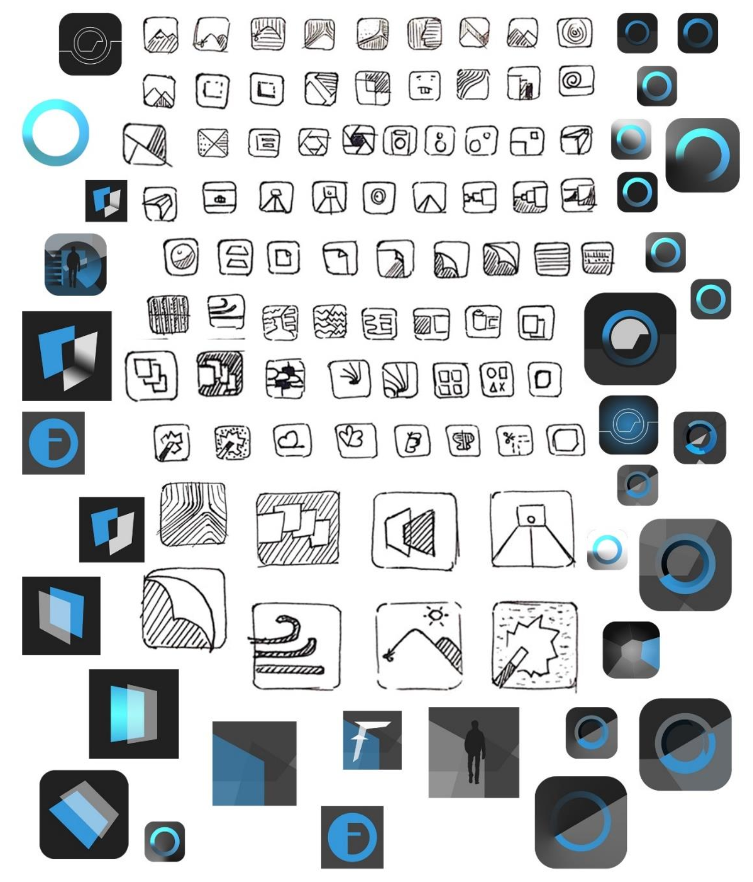
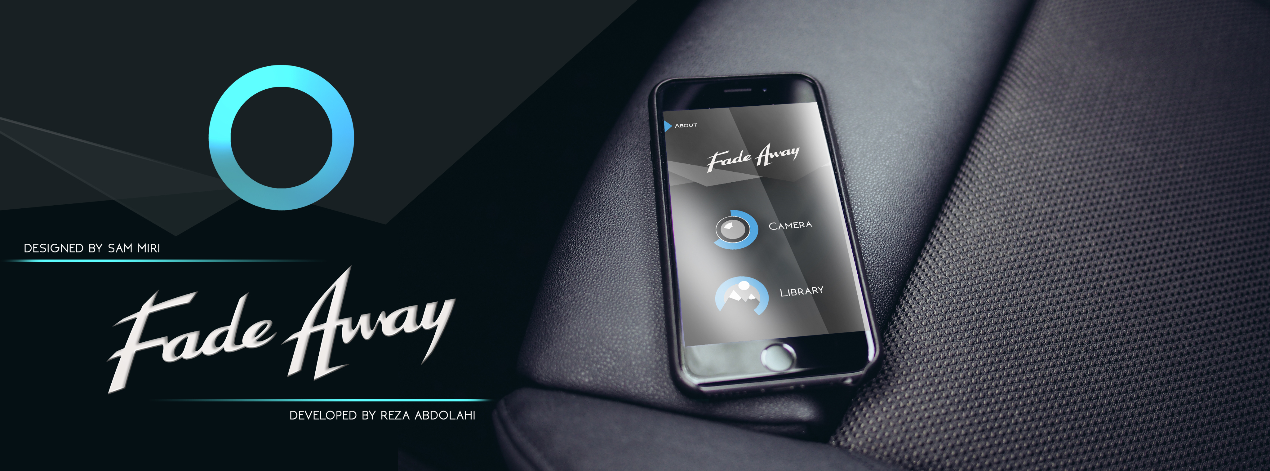
Logo
The logo was designed with sharp angles and cuts to suggest seriousness and modernity. Its form evokes a luxurious and bold brand, while also visually implying upward motion. The form is fluid and dynamic yet feels weighty and impactful.

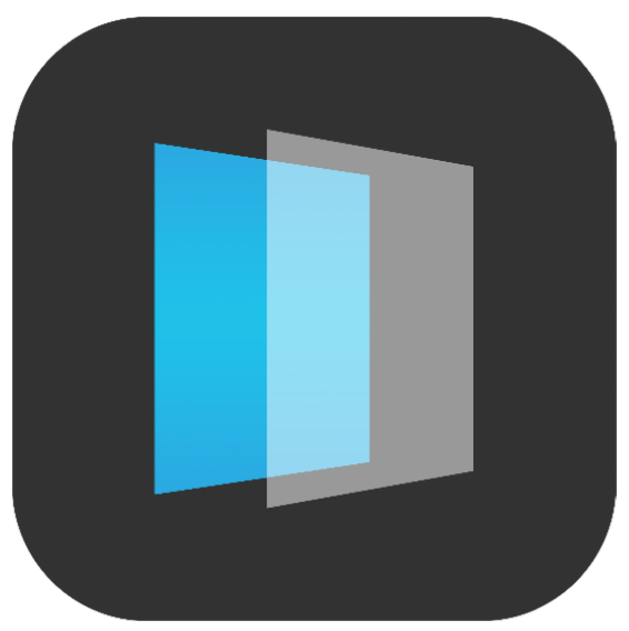
Icon
The app's icon is composed of two overlapping rectangular shapes with different levels of transparency and blue hues. This represents the concept of layers in image editing, illustrating the app’s main functionality.
Description
In the App Store product page, the description is one of the most critical touchpoints. It must be clear, concise, and informative, highlighting the app’s core value and encouraging downloads.
Screenshots
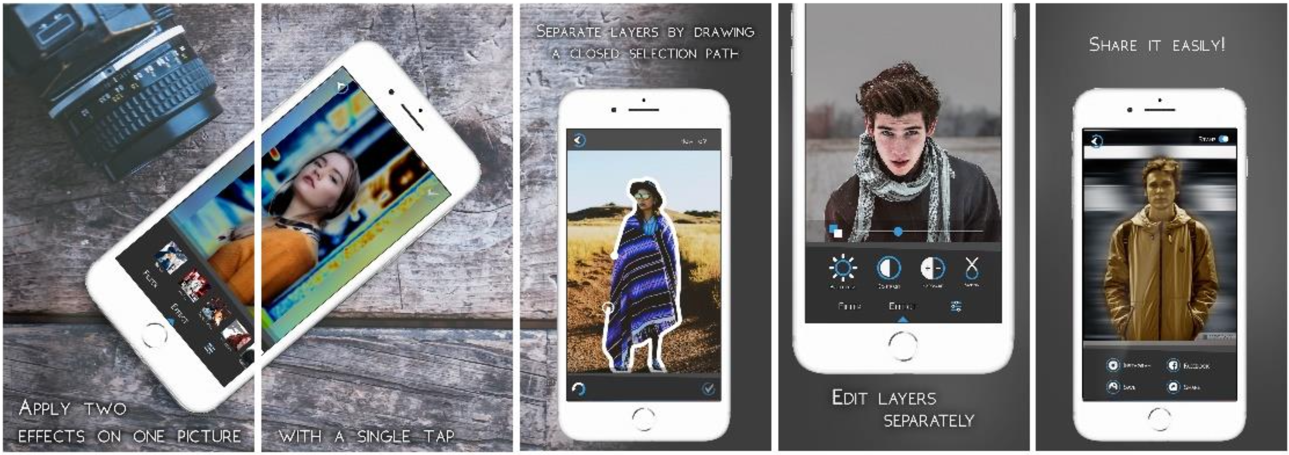
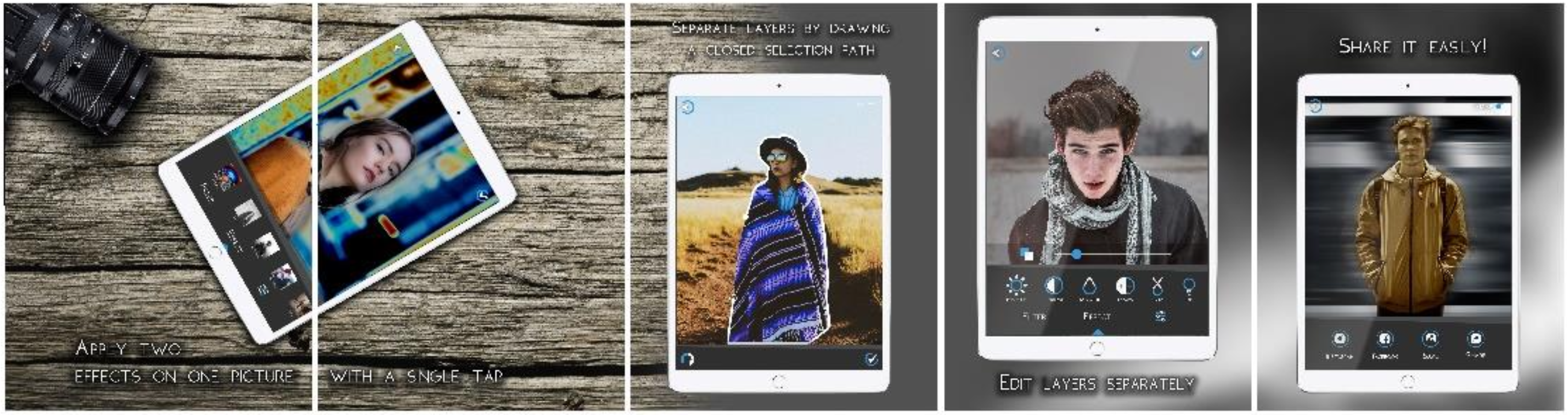
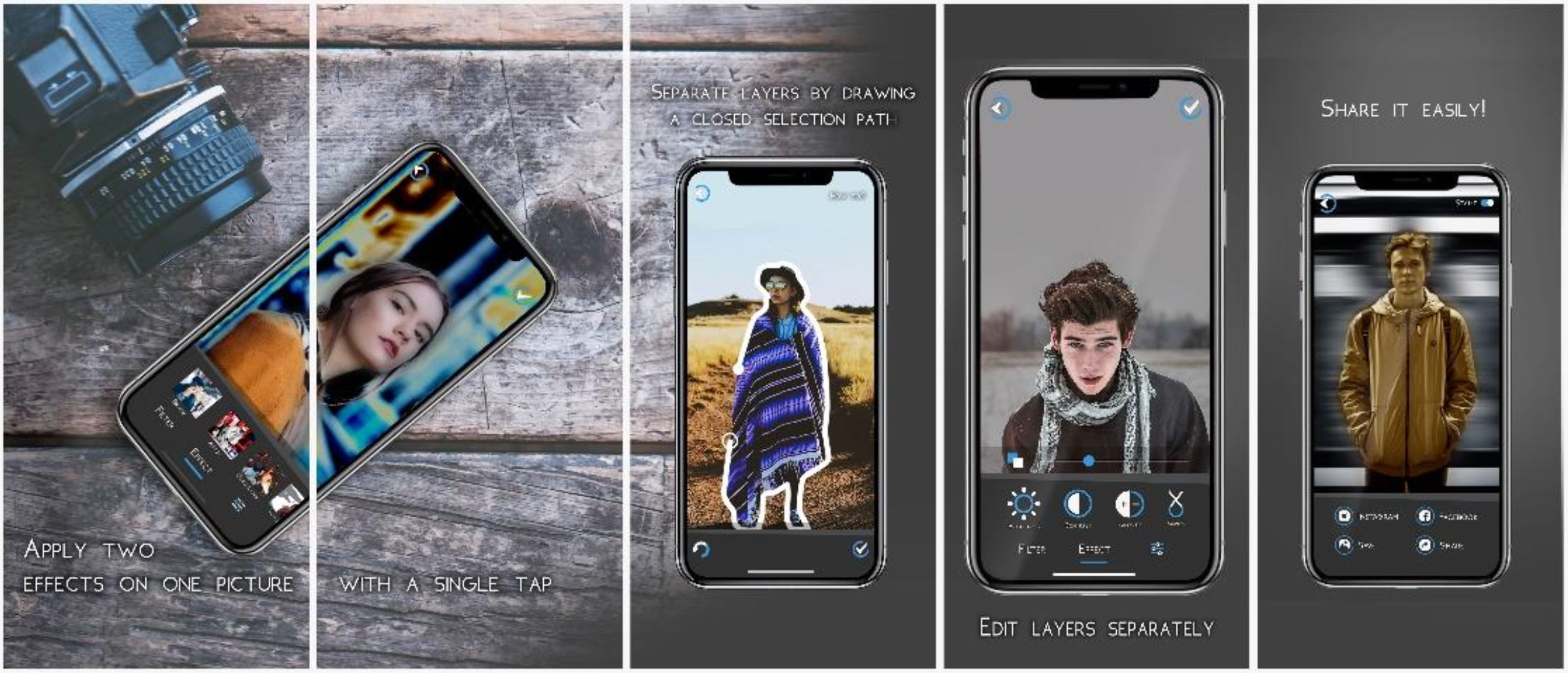
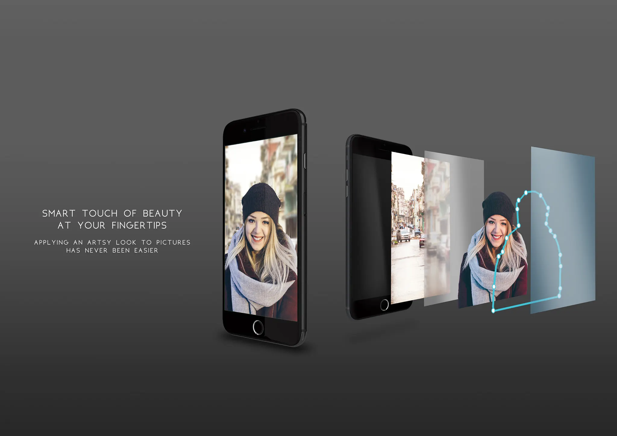
According to App Store regulations, developers must provide screenshots that clearly demonstrate the app’s main features and experience. These screenshots were optimized for Apple’s supported devices: iPhone 6, 6 Plus, 10, 10 Pro, and 13-inch iPads.
Video Teaser
A promotional animation was created using Adobe After Effects. The video, along with the accompanying music and visuals, was custom-made in compliance with copyright laws.
Website
A dedicated website was created to introduce the app to potential users and improve SEO for search engines like Google. It includes promotional posters, the teaser video, and a download link. The site was built with WordPress.
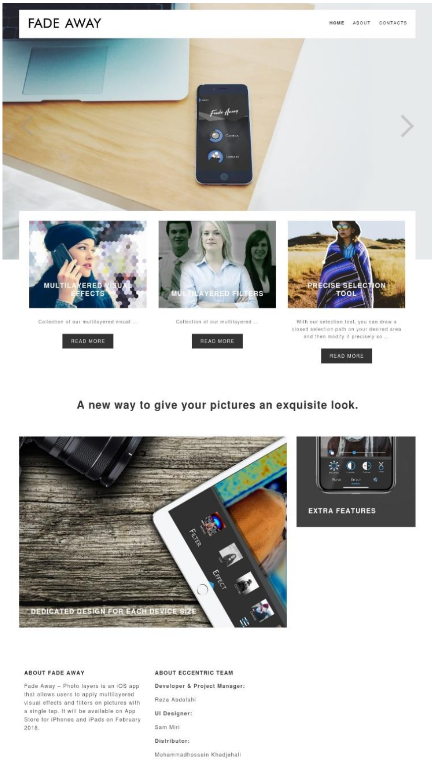
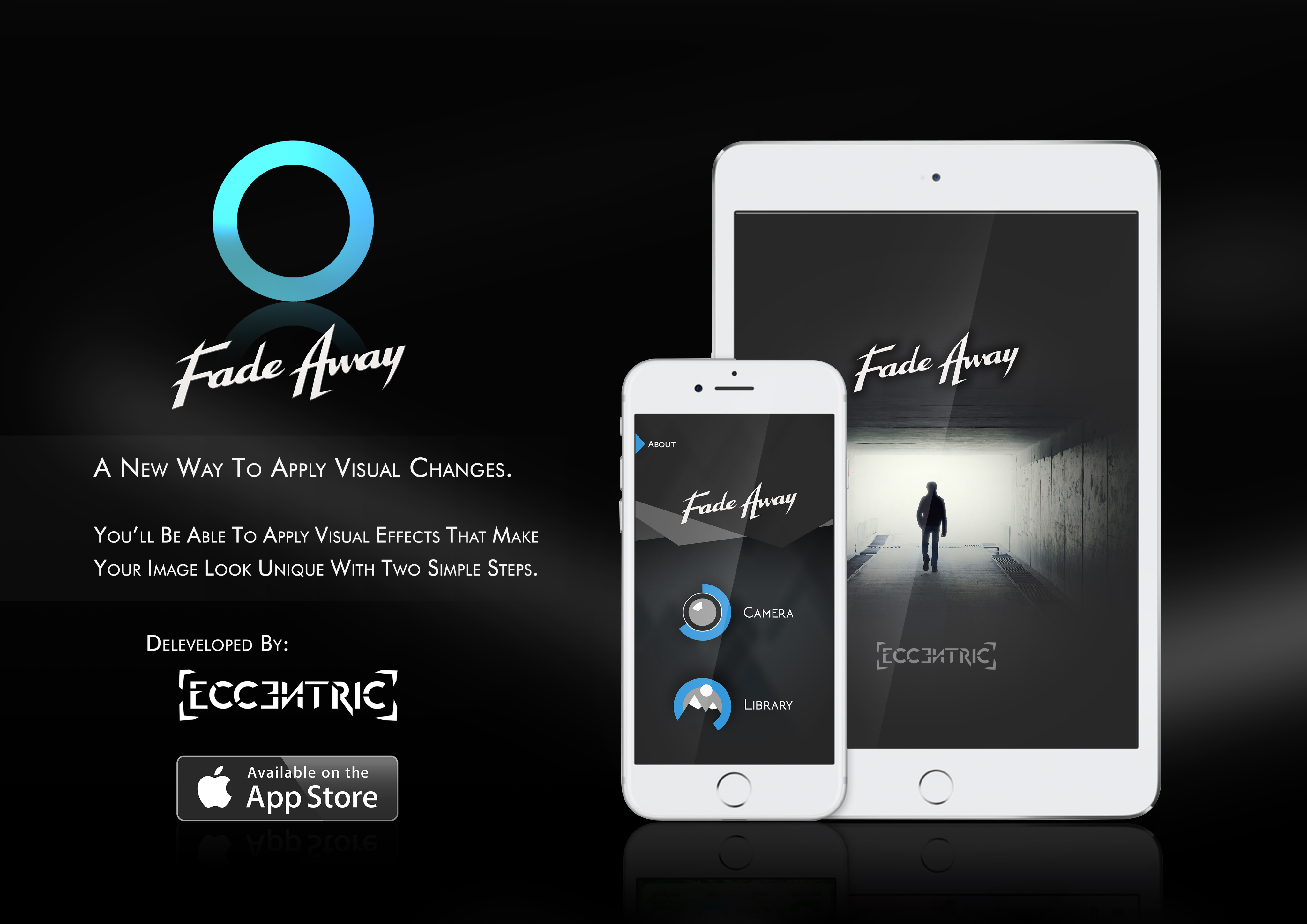
Promotional Posters
Several posters were designed for use across different media to highlight the app’s visual strengths and unique features.
Press Kit
A media/press kit was compiled, containing all contact points: logo files, app description, screenshots, teaser video, and more. This package was made available on the website as a downloadable zip file for journalists and media reviewers.
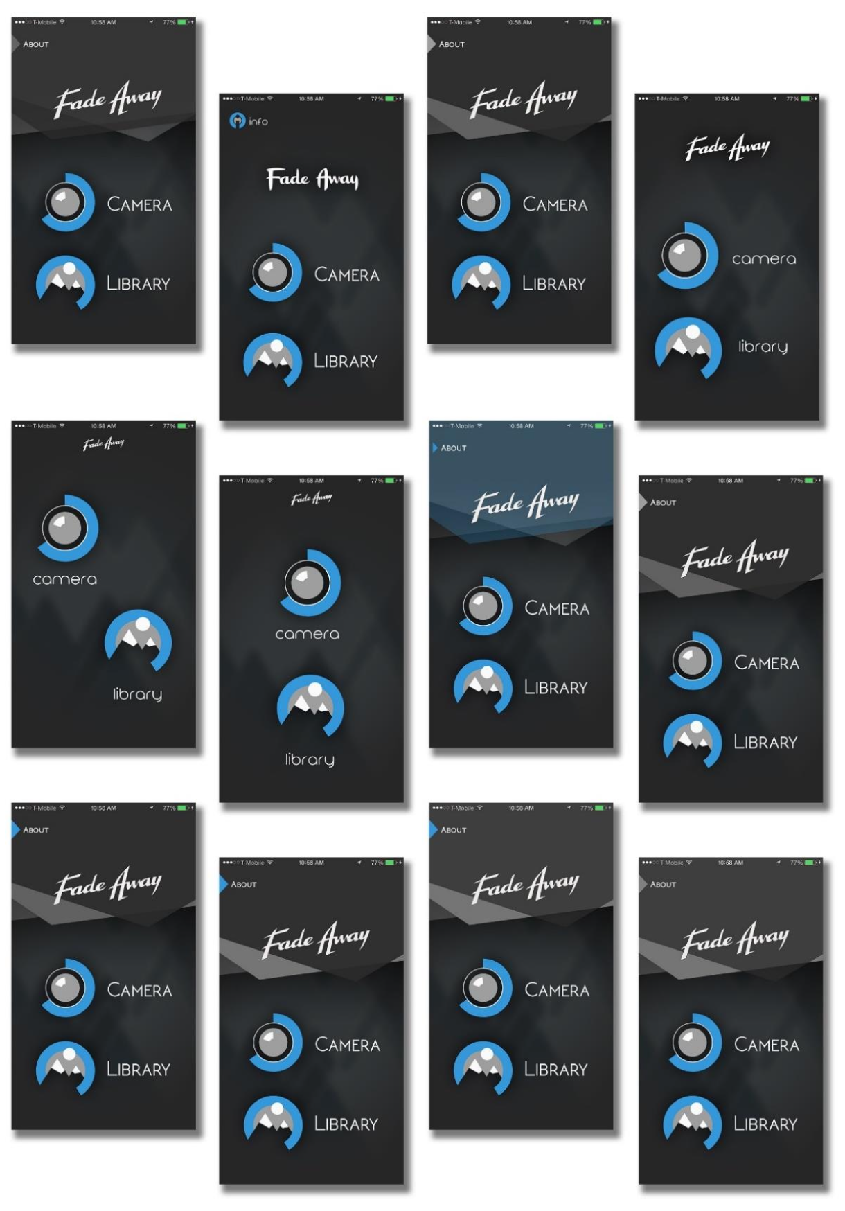
Interface Showcase
Final Screen Designs of the App
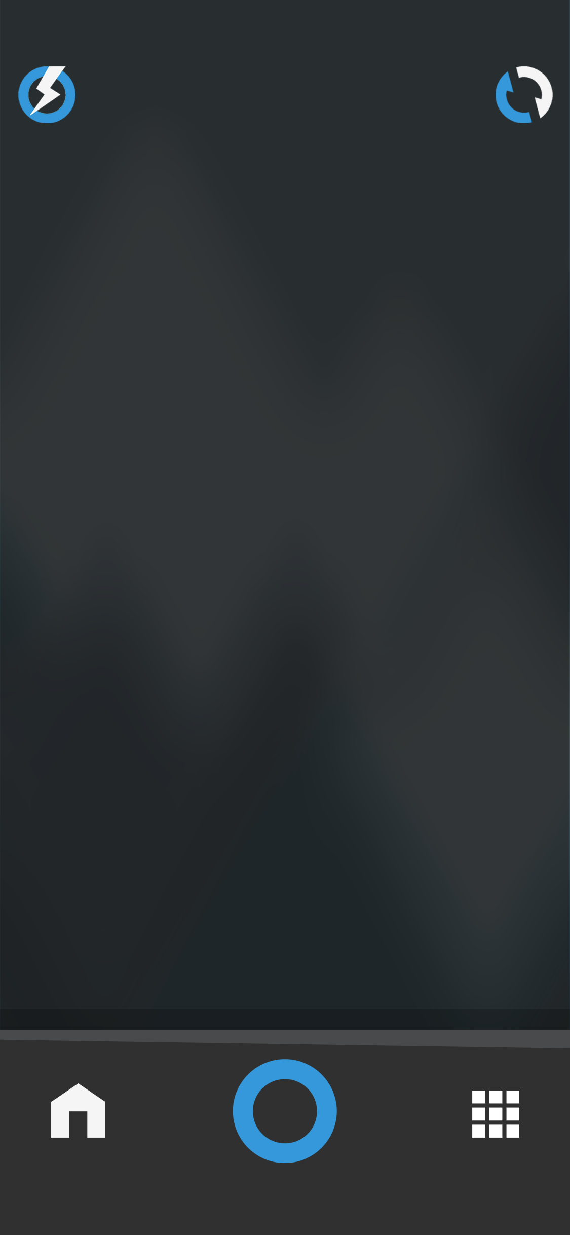
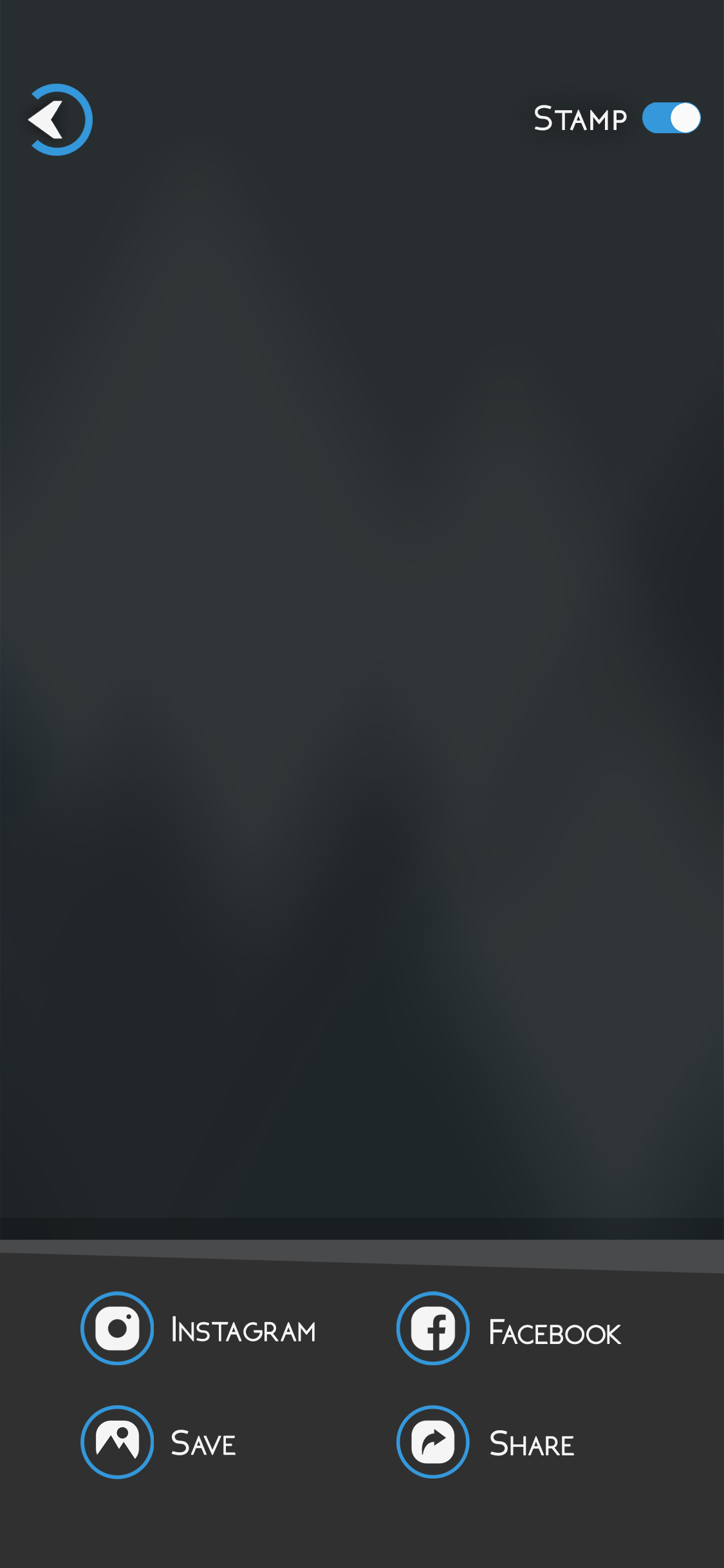
The following section presents the final visual interface of the mobile photo editing app, designed and developed through iterative user-centered processes. Each screen reflects a balance of usability, clarity, and custom visual identity.
From onboarding to editing and export, every step of the user journey has been carefully crafted using original graphic elements—including icons, typography, and UI components.
These screens represent the final state of the product before its release on the App Store in 2016.
Conclusion
The photo editing app developed in this project was successfully launched on the Apple App Store in 2016. It was initially offered as a paid product and later made available for free to reach a wider audience. While the application lacked strong marketing resources, which eventually led to a decline in download rates, the users who did install and use the app responded positively.
Many users left favorable ratings and reviews on the App Store and shared the images they created using the app—expressing satisfaction with both the results and the simplicity of the experience.
As a personal and independent project, the process offered invaluable learning opportunities. Both members of the team—designer and developer—gained firsthand experience in the complete lifecycle of mobile product design and implementation. This project played a meaningful role in shaping our professional paths and opened doors to career opportunities in successful companies.
Importantly, the project was also completed as a full academic design thesis and submitted to the Faculty of Fine Arts at the University of Tehran in 2018. It was successfully defended and received the highest possible grade. The final case study became a comprehensive documentation of the design process from concept to launch.
Sam Miri
Product & Visual Designer
Reza Abdolahi
iOS Developer
Contact
I’m always excited to connect and explore new ideas.Let’s create something meaningful together.


© 2025 Sam Miri. All rights reserved.


Academic Case Study
Mobile Photo Editing App (2016)
This case study summarizes the design and development of a mobile photo editing app, launched in 2016 as part of a Master’s thesis in Industrial Design at the University of Tehran, and defended in 2018.
The app was developed by a two-person team:
Sam Miri
Product & Visual Designer
Reza Abdolahi
iOS Developer
At a time when layer-based image editing was not common on smartphones, the app aimed to offer both simplicity and creative control in a mobile-first experience.
It was initially released on the Apple App Store at $2.99, made free after one year, and later removed in 2019.
The entire process followed the Design Thinking methodology, from research to prototype and testing. Visual design and mockups were created using Photoshop and CorelDRAW,
with interactions demonstrated via PowerPoint click-throughs.
This project demonstrates how academic design work can lead to a real-world product, even with minimal resources and tools available at the time.
Introduction
Project Overview
This project focuses on the design and development of a mobile photo editing application, created in 2016 during a time when mobile design tools and technologies were still in their early stages. The project was developed using the Design Thinking methodology, with the aim of creating an intuitive, easy-to-use, yet powerful editing tool tailored to everyday users and aspiring creators.
In 2016, smartphones were widely used for photography, but most available photo editing apps were either too basic or too complex. Layer-based editing, which is now common, was still largely absent from mobile applications. Moreover, AI-assisted features and intelligent filters had not yet become part of mainstream tools, making this app’s concept—focused on balancing simplicity with creative flexibility—significant for its time.
Challenges in the Market (as of 2016)
- Lack of smart editing tools: AI-powered editing and automatic enhancements were not available.
- Limited editing depth: Most apps only offered basic filters and adjustments without much control.
- Overcomplicated interfaces: Existing advanced apps often required technical knowledge.
- No support for layer-based workflow: Users lacked access to structured, non-destructive editing in mobile environments.
These limitations highlighted the need for a photo editing app that was both user-friendly and capable of deeper creative control—all designed with mobile-first interaction in mind.
Why This Project is Important?
Key Reasons for Developing This Application in 2016:
Rising mobile photography culture:Social media platforms like Instagram encouraged mobile photo creation and sharing.
Lack of mid-level editing tools:Users were stuck between extremely simple apps and overly complex ones.
Opportunity for innovation:A gap existed for an app that could offer a better balance of simplicity and flexibility.
Design Thinking as a framework:Applying user-centered methods helped guide features and usability in a way that stood out at the time.
User Research & Problem Definition
Objective
The goal of this phase was to understand how users interacted with existing photo editing apps in 2016, what their pain points were, and how a new mobile-first solution could better serve their needs. This aligned with the Empathize and Define stages of the Design Thinking process.
Research Methods (2016 Context)
Given the tools and practices available in 2016, user research was conducted using mostly manual and in-person methods, including:
- Printed questionnaires shared among students, photographers, and casual smartphone users
- One-on-one interviews (semi-structured) with a mix of novice and experienced users
- Observations of users editing photos on their mobile phones
- Review of App Store reviews from popular apps like Snapseed, VSCO, and Afterlight
Persona Development Process
The development of user personas followed a multi-stage approach inspired by methods described in the thesis:
- Pilot Personas – Initially, rough personas were outlined based on assumptions and early survey responses. These helped spark early design conversations and guide user interviews.
- Role-Playing Personas – During interviews, participants were asked to walk through scenarios (e.g., “You’ve just taken a photo you want to quickly enhance before posting to Instagram”) to better understand their behavior and preferences.
- Goal-Oriented Personas – Based on interview transcripts and pattern analysis, personas were refined to represent users not just by demographics, but by motivations, frustrations, and editing goals.
- Engaged Personas – Final personas were validated by presenting them back to select participants to verify accuracy. Their feedback confirmed the personas reflected real user types, which then informed design decisions.
User Personas
Two representative user personas were finalized through this iterative process:
Emma (Beginner User)
- Age: 22
- Background: University student, active Instagram user
- Needs: Quick, beautiful photo edits without technical steps
- Goals: Look good on social media, feel creative with minimal effort
- Frustrations: Overwhelmed by complex icons and tools, dislikes multi-step edits
David (Experienced User)
- Age: 34
- Background: Freelance designer, edits photos for client presentations
- Needs: Precision control over exposure, contrast, and color
- Goals: Professional-level results on the go without needing desktop software
- Frustrations: Mobile apps lack structure, too many taps for basic adjustments, no layering tools
Key Insights
- Simplicity was a top priority for most users, especially those unfamiliar with design tools
- Advanced users wanted more control, but still expected speed and usability
- No mobile app offered a balance between simplicity and structured editing
- Layer-based editing was highly desired but not found in mainstream mobile apps at the time
Problem Statement
In 2016, users needed a mobile photo editing app that offered ease of use for beginners and deeper control for experienced users—without relying on desktop workflows or sacrificing usability.
This problem statement guided the design priorities and helped establish a vision for the rest of the project.
Ideation & Concept Development
Objective
The ideation phase aimed to explore a wide range of solutions based on the needs and problems identified during user research. This phase corresponds to the Ideate stage of the Design Thinking process and was carried out using available analog tools and team-based methods appropriate for 2016.
Ideation Process
At the time, the design team used a paper-based and collaborative approach to generate ideas:
- Sketching concepts on paper and whiteboards
- Group brainstorming sessions focused on task-based scenarios
- Card sorting and clustering to organize ideas thematically
- Discussions around user personas (Emma and David) to assess ideas from both beginner and advanced user perspectives
The small team (designer + developer) worked closely to ensure each idea was not only desirable but also technically feasible on iOS devices of the time.
Framing the Design Challenges
Key user needs and frustrations were turned into challenge questions:
- How can we help users like Emma edit photos without getting overwhelmed?
- What features would give David professional-level control on a small screen?
- How can we deliver an editing experience that feels fast and intuitive?
Key Concept Directions
- Two-Level Editing Modes
- Quick Edit Mode: For users like Emma, featuring automatic adjustments and one-tap filters
- Advanced Edit Mode: For users like David, offering sliders for brightness, contrast, color balance, and crop controls
- Non-Destructive Layer-Like Workflow
- Though true layering wasn’t available, the app simulated it by letting users apply effects in order and modify them later
- Minimal Interface with Large Controls
- Simplified UI using icons, toggle buttons, and swipe gestures to streamline navigation
- Preset Library and Favorites
- Allowing users to save their favorite filter combinations and reapply them easily
Prioritization and Selection
After sketching multiple solutions, ideas were evaluated based on:
- Alignment with Emma and David’s goals
- Ease of implementation within the available timeline and tools
- Simplicity and learning curve for first-time users
High-impact ideas were selected for wireframing and early prototype testing.
Prototyping & UI/UX Design
Objective
The goal of this phase was to translate selected concepts into visual and structural designs that could simulate the user experience and be tested for usability. This phase corresponds to the Prototype stage of the Design Thinking process and was conducted using tools and methods available in 2016.
Wireframing
- Hand-drawn wireframes to outline basic screen layouts and interactions
- Adobe Photoshop for mid-fidelity mockups
- CorelDRAW for organizing layout elements and interface structure
Wireframes focused on core flows:
- Selecting an image from camera or gallery
- Applying edits (filters, crop, adjustments)
- Saving and exporting the result
Wireframes were reviewed iteratively between designer and developer, making quick adjustments based on technical limitations and usability assumptions.
User Flow Design
A clear user flow diagram was created to map the main tasks, from launching the app to completing a photo edit. This included:
- Main screen → Camera/Gallery
- Crop or select area
- Apply edits (filters, adjustments)
- Save or share
The flow emphasized speed, clarity, and simplicity, especially for new users like Emma. Navigation was reduced to a few key screens, with minimal layering to avoid confusion.
UI Design Considerations
Visual design emphasized:
- Minimal interfaces with clean iconography
- Dark background to enhance focus on images
- Large tap targets for easier interaction on small screens
- Flat visual style popular at the time, avoiding gradients and shadows
All graphical elements — including icons, UI components, and illustrations — were originally designed for this project. No assets were copied or sourced externally. The design was created from scratch to maintain a cohesive and unique visual identity.
Prototype Simulation
Since no interactive prototyping tools like InVision or Figma were in use, interactivity was demonstrated through:
- Sequential Photoshop mockups exported as image slides
- PDF-based click-throughs to simulate navigation flow
- Occasionally, PowerPoint presentations to walk stakeholders through screens
These methods allowed the team to validate the look and logic of the app before implementation.
Usability Testing & Iteration
Objective
The aim of this phase was to evaluate the prototype’s usability and gather feedback from potential users. This corresponds to the Test phase of the Design Thinking process. Testing was conducted with tools and methods suited to 2016’s resource constraints.
Testing Setup
Due to the limited availability of interactive prototyping tools, the team used:
- Printed mockups for task-based walkthroughs
- Slide-based simulations in PDF or PowerPoint format
- In-person usability tests with real users, primarily students and creatives familiar with photo apps
Participants were asked to perform simple tasks such as:
- Selecting a photo
- Applying a filter or edit
- Saving and exiting
Observers recorded usability issues, time to task completion, and user reactions.
Key Findings
- Positive Reaction to Simplicity
- Most users appreciated the clean UI and minimal steps required to complete edits.
- Misunderstood Icons
- A few icons needed redesign as users misinterpreted their function.
- Confusion Around Edit Modes
- Some users were unsure of when they were in quick or advanced editing mode, prompting a clearer visual indicator.
- Desire for Undo/Redo
- Users frequently asked for undo/redo functions, which were added to the feature list.
Iteration Process
Following the feedback:
- Icons were redesigned to improve clarity
- Visual cues (such as header labels and active-state highlights) were added to distinguish edit modes
- The save and export flow was simplified
- Additional tips were embedded for first-time users
Each change was validated through internal reviews and follow-up sessions with a subset of previous testers.
Impact
These iterations significantly improved:
- Task completion time
- User confidence
- Overall satisfaction with the prototype
They also reinforced the value of low-cost, early-stage testing, especially when access to high-fidelity interactive tools is limited.
Implementation & Deployment
Objective
This final phase focused on building a fully functional iOS app based on the validated prototype, preparing it for public release on the Apple App Store.
Development Process
The app was developed in Objective-C, which was the standard language for iOS development at the time. The developer (Reza Abdolahi) worked closely with the designer (Sam Miri) to ensure accurate translation of the UI mockups into a usable interface.
Key Focus Areas:
- Maintaining fidelity to the original design
- Ensuring performance on a range of iPhones available in 2016
- Implementing features like Quick Edit, Advanced Edit, undo/redo, and image export
Version control was managed manually using shared folders and backups, as GitHub integration was not part of the team’s workflow at the time.
App Store Preparation
The team prepared all required assets and documentation for submission:
- App icon and screenshots (designed manually in Photoshop)
- Description and keywords optimized for discoverability
- Privacy policy and support email created to comply with App Store guidelines
The app was submitted and approved for the App Store in 2016, priced at $2.99.
Post-Launch Feedback
After launch, the app received positive feedback for its clean interface and intuitive controls. Key observations included:
- Users praised its speed and simplicity
- Some advanced users requested more manual controls (to be considered for future versions)
Lifecycle Summary
- Year 1: Paid version available at $2.99
- Year 2: App made free to expand reach
- 2019: App retired and removed from App Store
Final Result
Objective
The final result of this project was the successful design, development, and market launch of a mobile photo editing application tailored for iOS. Released in 2016, the app was designed at a time when The concept of simplified, layer-based mobile editing was still emerging.
This project was developed by a two-person team: Sam Miri (designer) and Reza Abdolahi (iOS developer). The application was sold on the Apple App Store for $2.99 during the first year and was later offered for free before being removed in 2019.
Product Launch and Distribution
After testing and revisions, the app was released on the Apple App Store in the United States and other English-speaking markets. The development team ensured all Apple guidelines and legal requirements were met. After launch, one round of updates was released to fix minor issues.
The app was offered as a paid product, initially priced at $1.99 in the U.S. and $2.63 in Canada. Revenue, after tax deductions, was deposited monthly to the developer’s account. Payments were processed via Apple’s system, and users could purchase the app using major credit cards, PayPal, or associated banking accounts. Apple also offered refund options for unsatisfied users.
Visual Identity and Contact Points
The final version included custom-designed screens, typography, and interaction elements. Every visual touchpoint with users was developed with consistency in mind:
App Name: Fade Away
The term “Fade Away” in English combines the ideas of vanishing and fading out. The name metaphorically reflects the core function of the app—visually separating and gradually removing parts of an image through layered editing.
Logo
The logo was designed with sharp angles and cuts to suggest seriousness and modernity. Its form evokes a luxurious and bold brand, while also visually implying upward motion. The form is fluid and dynamic yet feels weighty and impactful.
Icon
The app's icon is composed of two overlapping rectangular shapes with different levels of transparency and blue hues. This represents the concept of layers in image editing, illustrating the app’s main functionality.
Description
In the App Store product page, the description is one of the most critical touchpoints. It must be clear, concise, and informative, highlighting the app’s core value and encouraging downloads.
Screenshots
According to App Store regulations, developers must provide screenshots that clearly demonstrate the app’s main features and experience. These screenshots were optimized for Apple’s supported devices: iPhone 6, 6 Plus, 10, 10 Pro, and 13-inch iPads.
Video Teaser
A promotional animation was created using Adobe After Effects. The video, along with the accompanying music and visuals, was custom-made in compliance with copyright laws.
Website
A dedicated website was created to introduce the app to potential users and improve SEO for search engines like Google. It includes promotional posters, the teaser video, and a download link. The site was built with WordPress.
Promotional Posters
Several posters were designed for use across different media to highlight the app’s visual strengths and unique features.
Press Kit
A media/press kit was compiled, containing all contact points: logo files, app description, screenshots, teaser video, and more. This package was made available on the website as a downloadable zip file for journalists and media reviewers.
Interface Showcase
Final Screen Designs of the App
The following section presents the final visual interface of the mobile photo editing app, designed and developed through iterative user-centered processes. Each screen reflects a balance of usability, clarity, and custom visual identity.
From onboarding to editing and export, every step of the user journey has been carefully crafted using original graphic elements—including icons, typography, and UI components.
These screens represent the final state of the product before its release on the App Store in 2016.
Conclusion
The photo editing app developed in this project was successfully launched on the Apple App Store in 2016. It was initially offered as a paid product and later made available for free to reach a wider audience. While the application lacked strong marketing resources, which eventually led to a decline in download rates, the users who did install and use the app responded positively.
Many users left favorable ratings and reviews on the App Store and shared the images they created using the app—expressing satisfaction with both the results and the simplicity of the experience.
As a personal and independent project, the process offered invaluable learning opportunities. Both members of the team—designer and developer—gained firsthand experience in the complete lifecycle of mobile product design and implementation. This project played a meaningful role in shaping our professional paths and opened doors to career opportunities in successful companies.
Importantly, the project was also completed as a full academic design thesis and submitted to the Faculty of Fine Arts at the University of Tehran in 2018. It was successfully defended and received the highest possible grade. The final case study became a comprehensive documentation of the design process from concept to launch.
Sam Miri
Product & Visual Designer
Reza Abdolahi
iOS Developer
Contact
I’m always excited to connect and explore new ideas.Let’s create something meaningful together.
© 2025 Sam Miri. All rights reserved.