
3D Augmented
The Next Level for Your Business

Leading Design at ARmo — Building an AR Platform from the Ground Up
Introduction
ARmo is a pioneering AR/VR startup helping e-commerce businesses present their products in a truly interactive and realistic way. Our goal has always been to bridge the gap between how customers imagine a product and how they experience it in real life.
I’ve been part of ARmo since its early days — almost four years — leading everything related to design: from product and UX/UI to visual identity, marketing, and social media.
My Role and Responsibilities:As the Lead Product Designer, I was responsible for defining and shaping the entire design direction of the company.
My work included:
- UX & UI design for web and mobile platforms
- Creating and maintaining the brand identity and visual assets
- Designing marketing materials, landing pages, and social media content
- Collaborating with the CEO and CTO to define product strategy and roadmap
- Contributing to product management and feature definition from day one
Where Design Meets Reality
Designing for ARmo meant transforming imagination into interaction.
Working closely with our CEO and CTO, I defined the product’s structure, designed every screen, and built a consistent visual identity that connects brand and product.
What follows is a collection of key designs — from public-facing pages to in-product experiences — all reflecting one vision: making augmented reality feel effortless.
Landing Pages
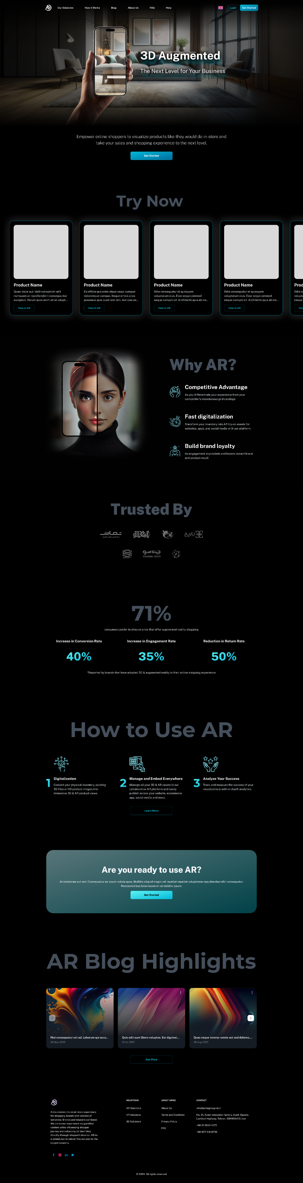
Homepage
Introducing ARmo
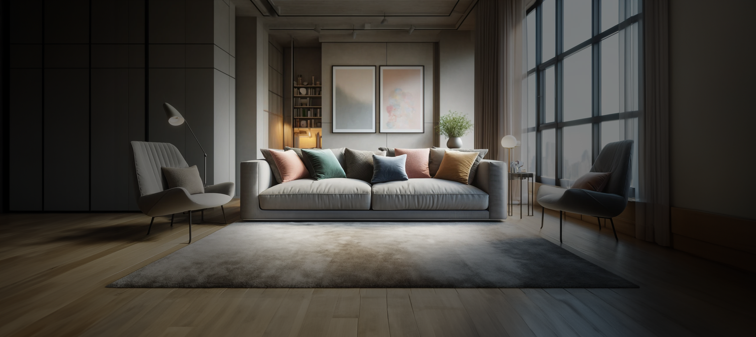
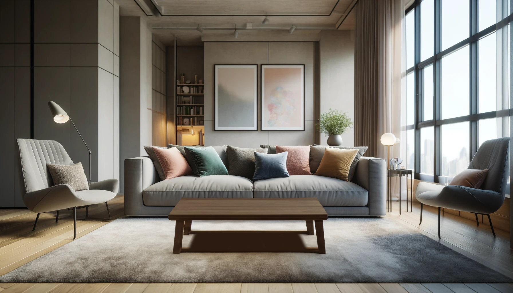
The homepage was designed to introduce ARmo’s value proposition in a clear and visually immersive way.
The hero section highlights the core concept — bridging digital and physical worlds through augmented reality — with an interactive visual that immediately communicates the product’s purpose. Below, the “Try Now” and “Why AR?” sections guide visitors to understand how the platform works and the benefits of adopting AR in e-commerce.
The layout combines futuristic visuals, clean typography, and strategic contrast to reflect ARmo’s high-tech identity while maintaining usability and clarity.
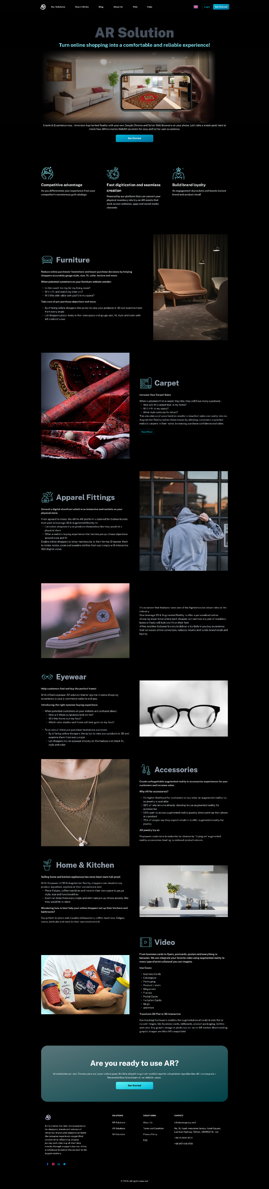
AR Solution Landing Page
This page introduces ARmo’s core product offerings and demonstrates how augmented reality enhances online shopping across multiple industries.
The structure highlights the three main brand values — innovation, simplicity, and trust — while showcasing real-world use cases such as furniture, apparel, and home décor.
The visual rhythm alternates between large imagery and concise text blocks to maintain engagement and readability.
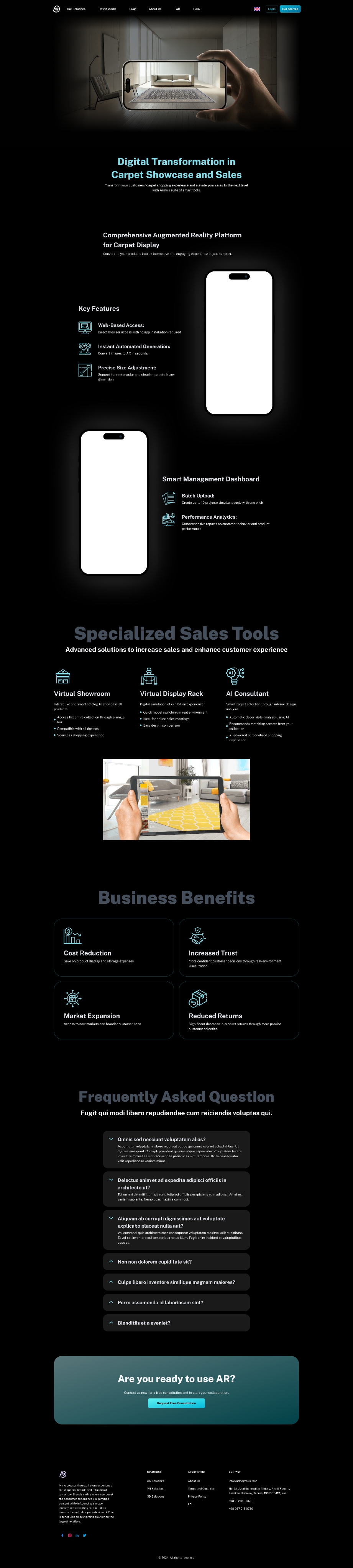
Carpet AR Landing Page
Focused on digital transformation for carpet retailers, this page demonstrates how AR visualization helps customers see textures and dimensions in their own spaces.
The design balances detailed explanations with visual hierarchy, keeping attention on the product experience.
Feature cards and statistics emphasize measurable benefits like reduced returns and increased conversion rates.
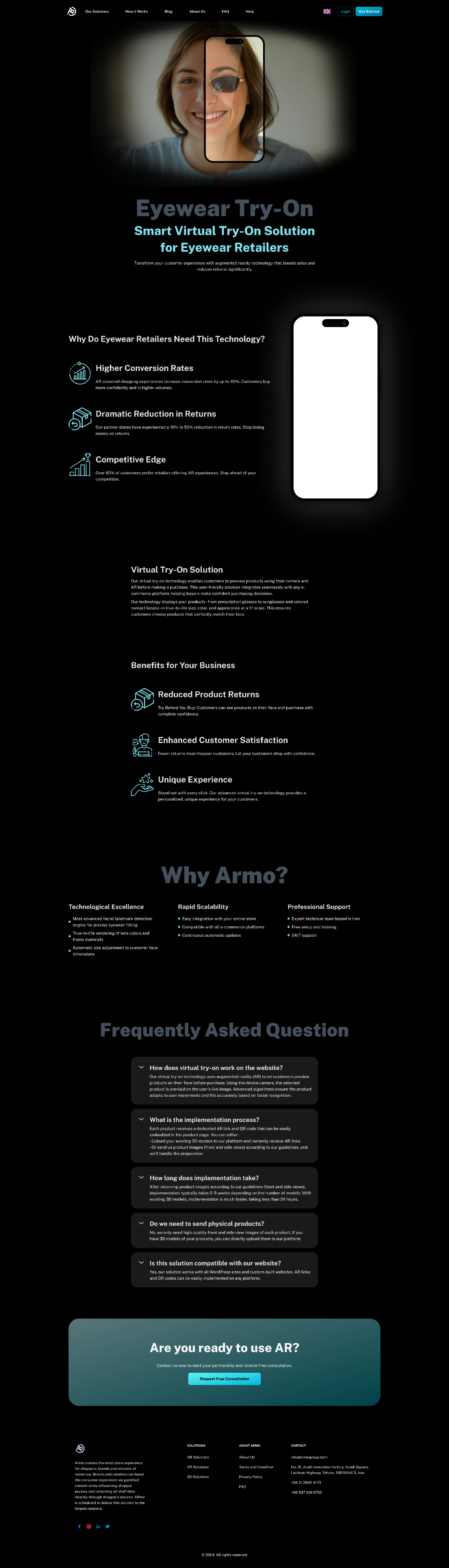
Eyewear Try-On Page
This page introduces ARmo’s virtual try-on solution for eyewear brands, designed to increase customer confidence and reduce product returns.
The hero section features a human-centered visual that instantly communicates the idea of trying before buying.
The layout follows a clean and modern grid with focus on conversion-oriented messaging and clear business benefits.
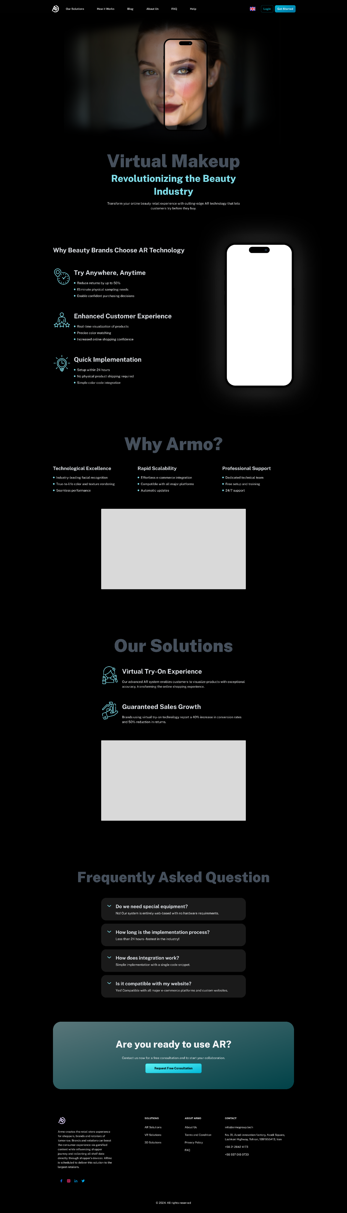
Virtual Makeup Landing Page
Aimed at the beauty and cosmetics industry, this page presents how ARmo’s technology enables users to virtually test makeup products in real time.
The tone is modern and aspirational, with a strong emphasis on personalization and user experience.
The “Why Armo?” and “Our Solutions” sections reinforce the company’s credibility and technical excellence through concise, visually guided storytelling.
Registration
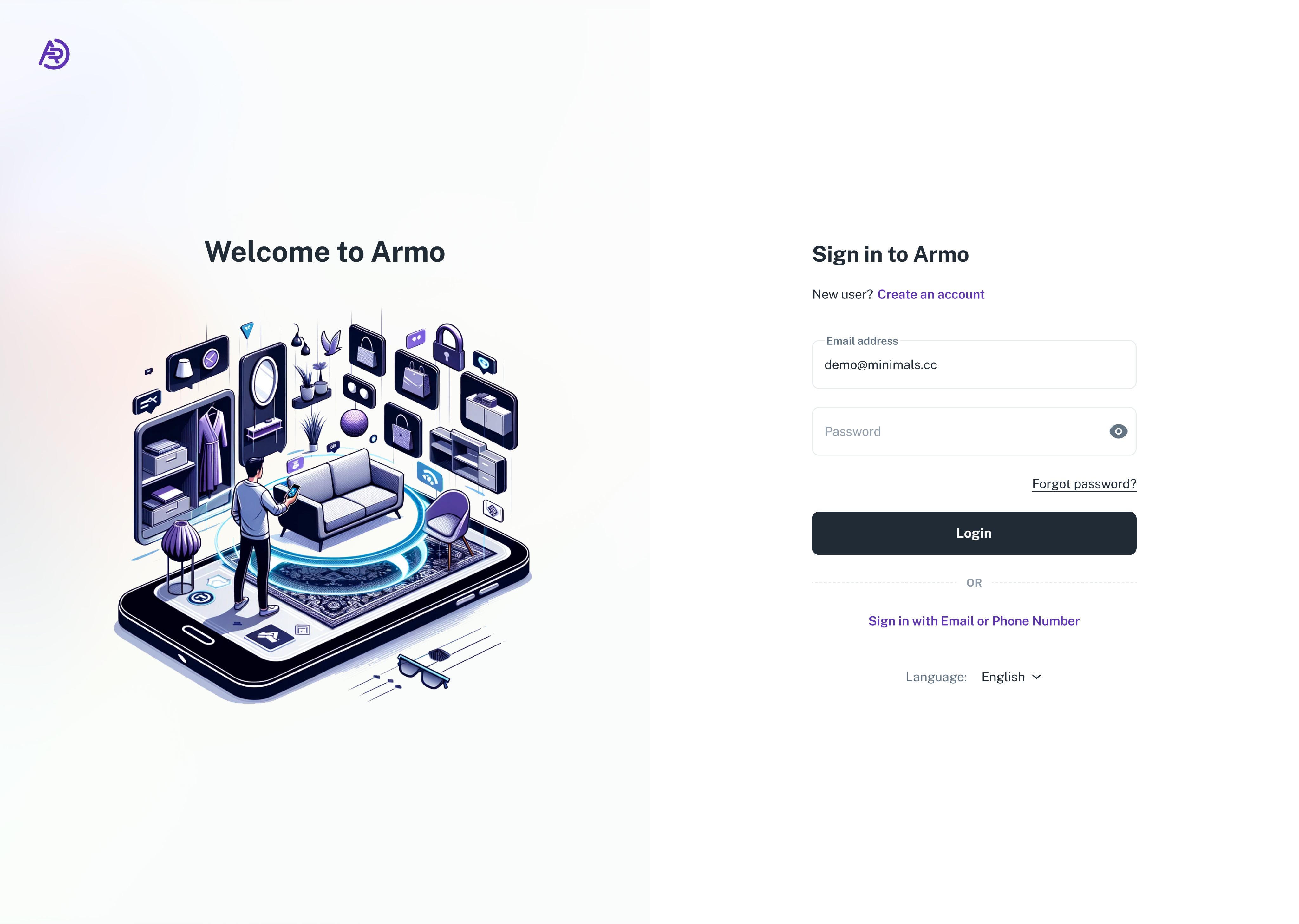
Sign In Page
The sign-in screen was designed to make the first interaction feel simple and trustworthy. A clean layout, soft illustration, and minimal input fields guide users smoothly into the platform. The option to sign in with email or phone number ensures flexibility and accessibility for different user groups.
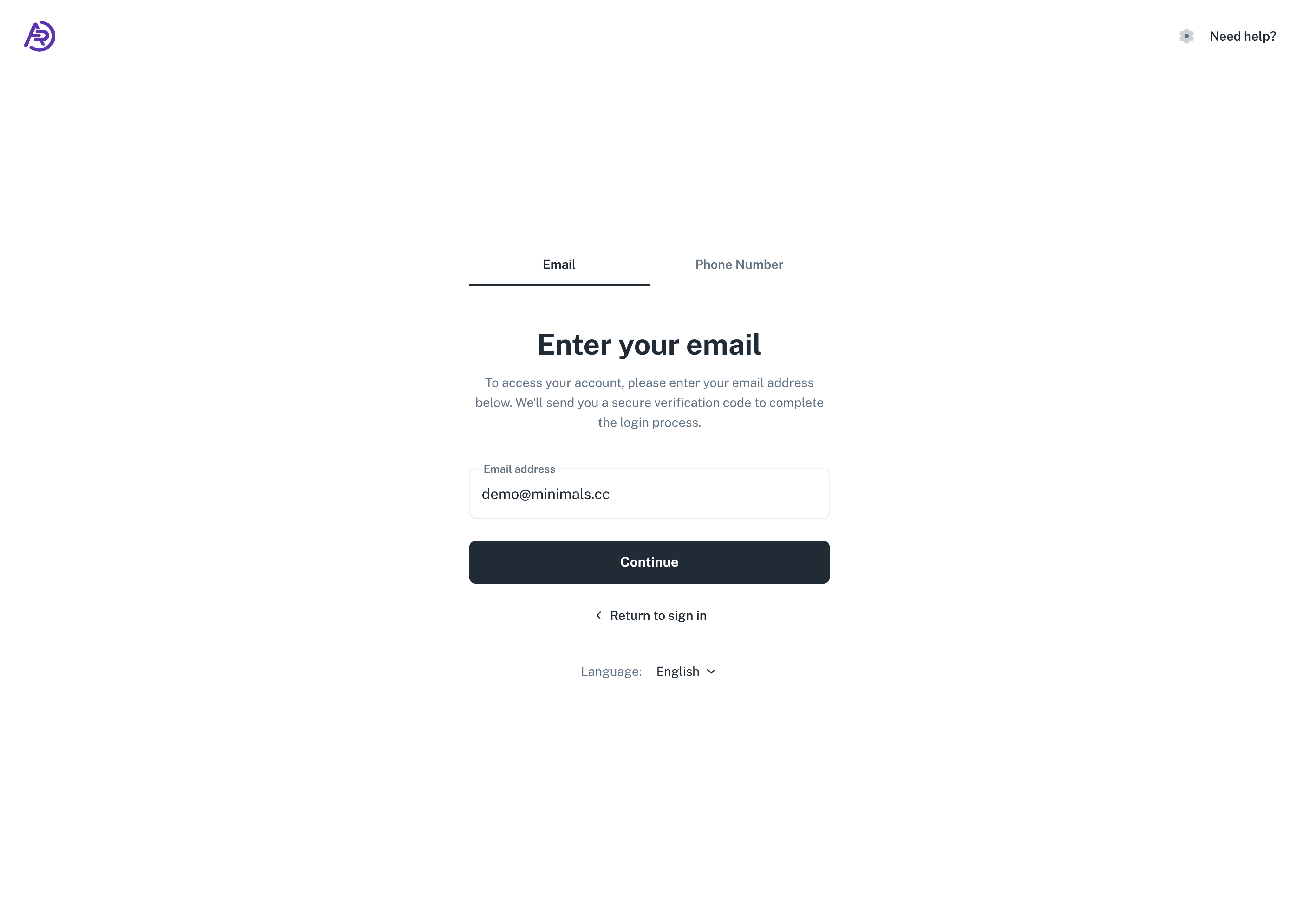
Email Login Flow
To simplify authentication, the login process uses a secure one-step verification code sent to the user’s email. This eliminates password complexity while keeping the process familiar and frictionless. The interface focuses on clarity and minimal visual noise, encouraging quick completion.
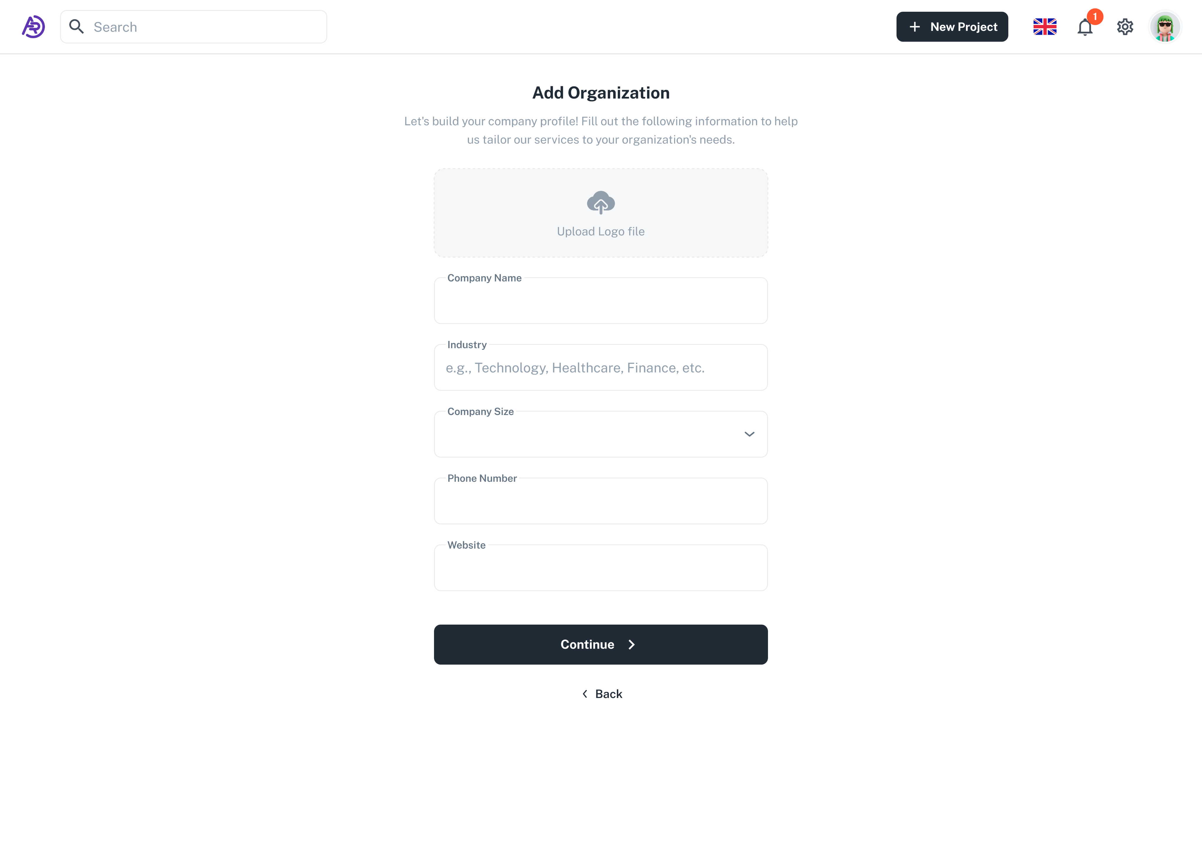
Add Organization
After signing in, users are guided to create their organization profile. This page helps personalize the experience by gathering essential information such as company name, industry, and size. The layout follows a form-driven design with clear hierarchy and strong focus on usability and readability.
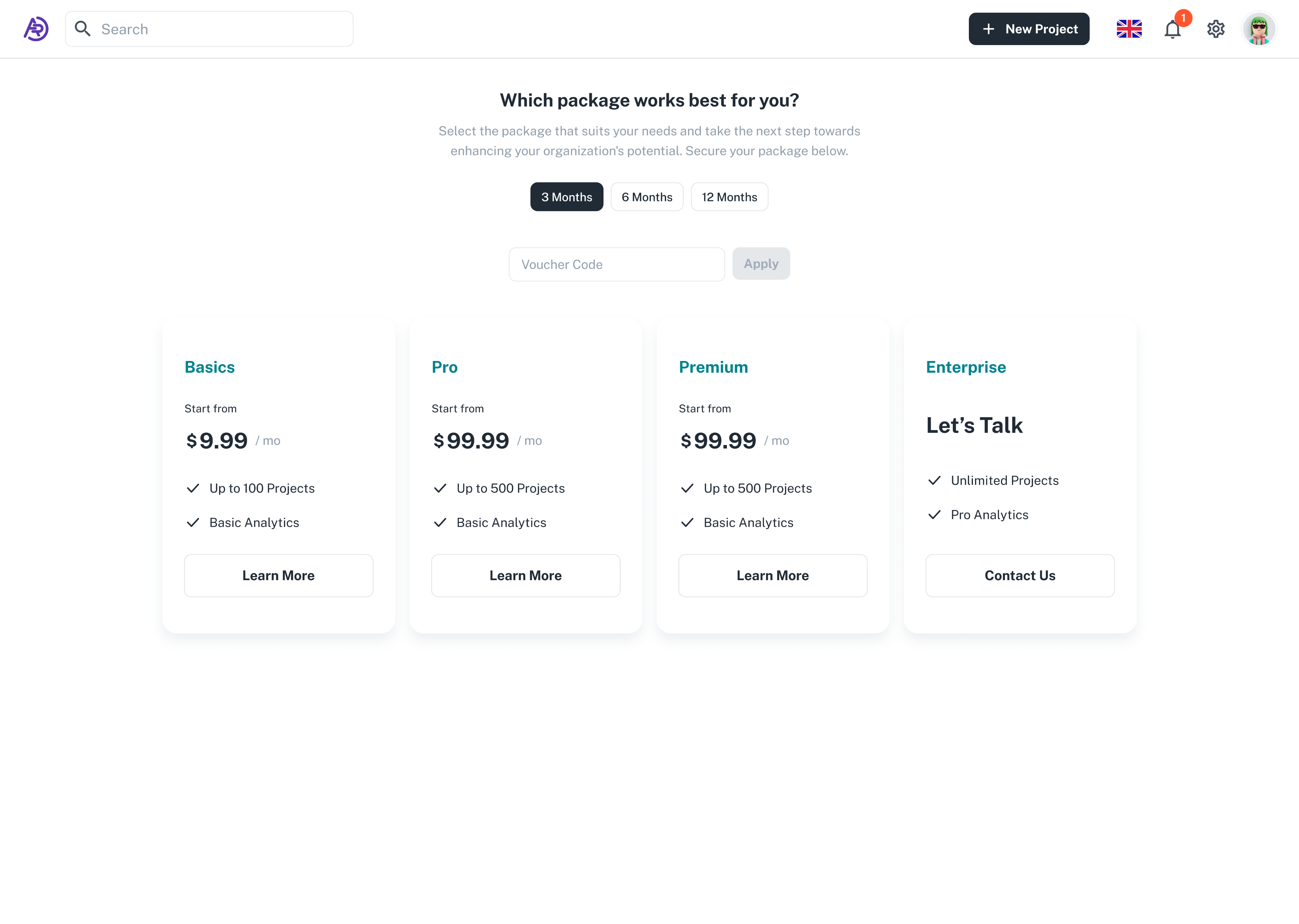
Subscription / Choose Package
The subscription screen allows users to select the most suitable plan for their business needs. Pricing cards are visually consistent, with clear contrast and legible typography, making comparison easy. The design emphasizes transparency and trust by presenting all options upfront with simple call-to-actions.
Add Project
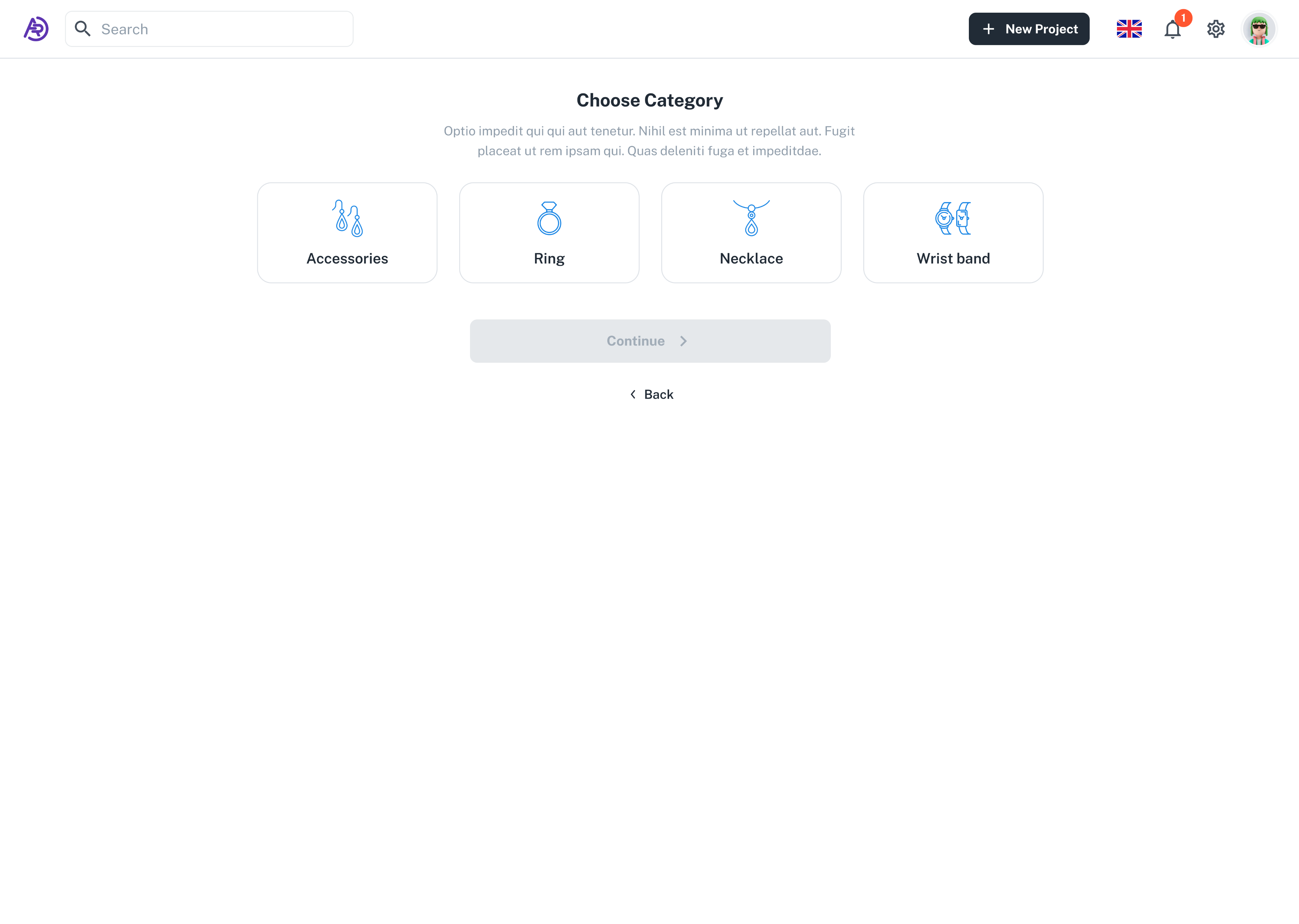
Choose Category
The first step of project creation helps users categorize their products easily. By using clear icons and a minimal layout, the page ensures that even first-time users can intuitively select the right product type (e.g., ring, necklace, accessories). The goal was to reduce cognitive load and make the onboarding process smooth and visually consistent.
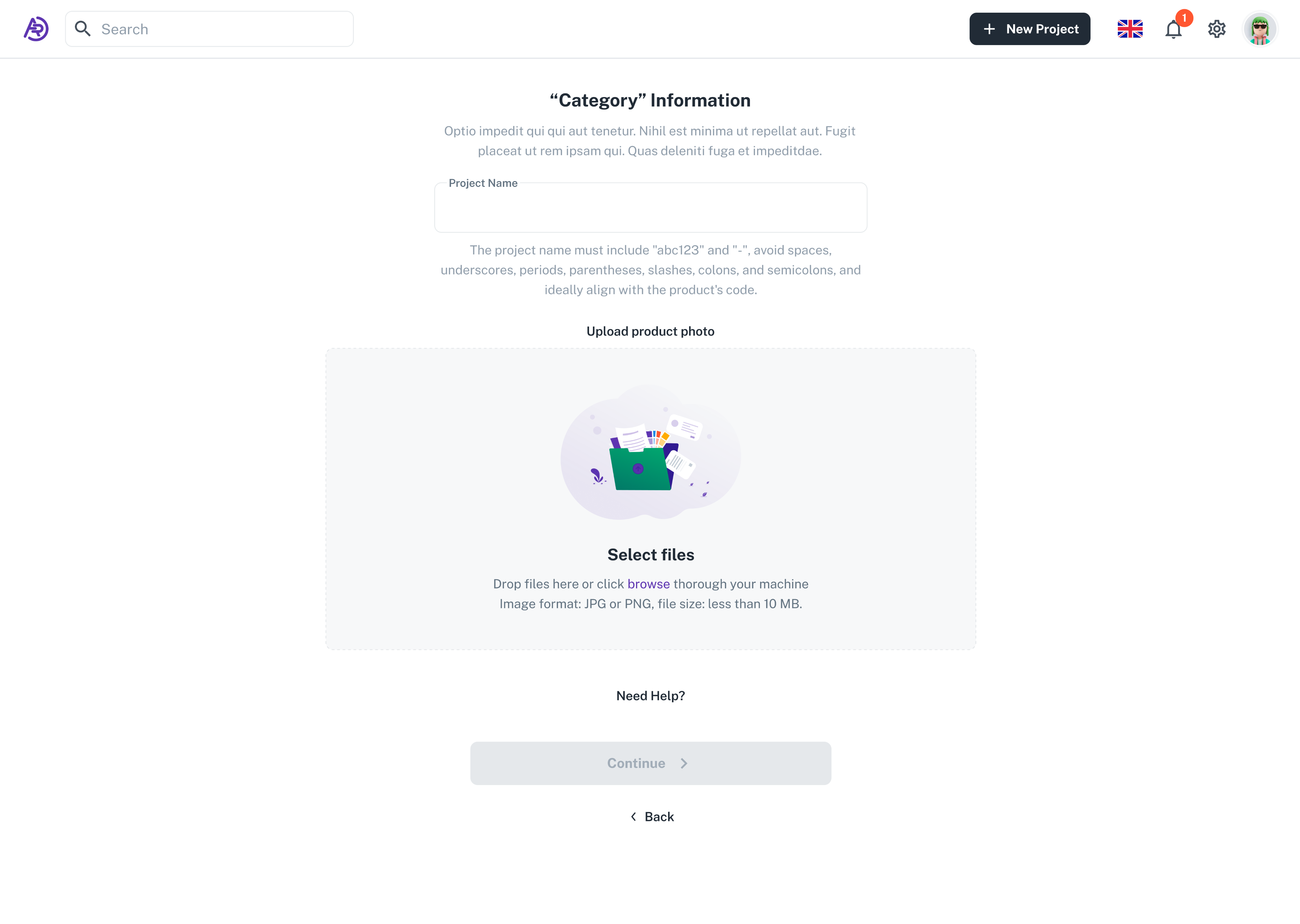
Category Information
In this stage, users upload photos and metadata for their product. The form enforces simple rules for file naming and image format to ensure consistency across the platform. The layout emphasizes clarity and prevents errors through validation and helper text.
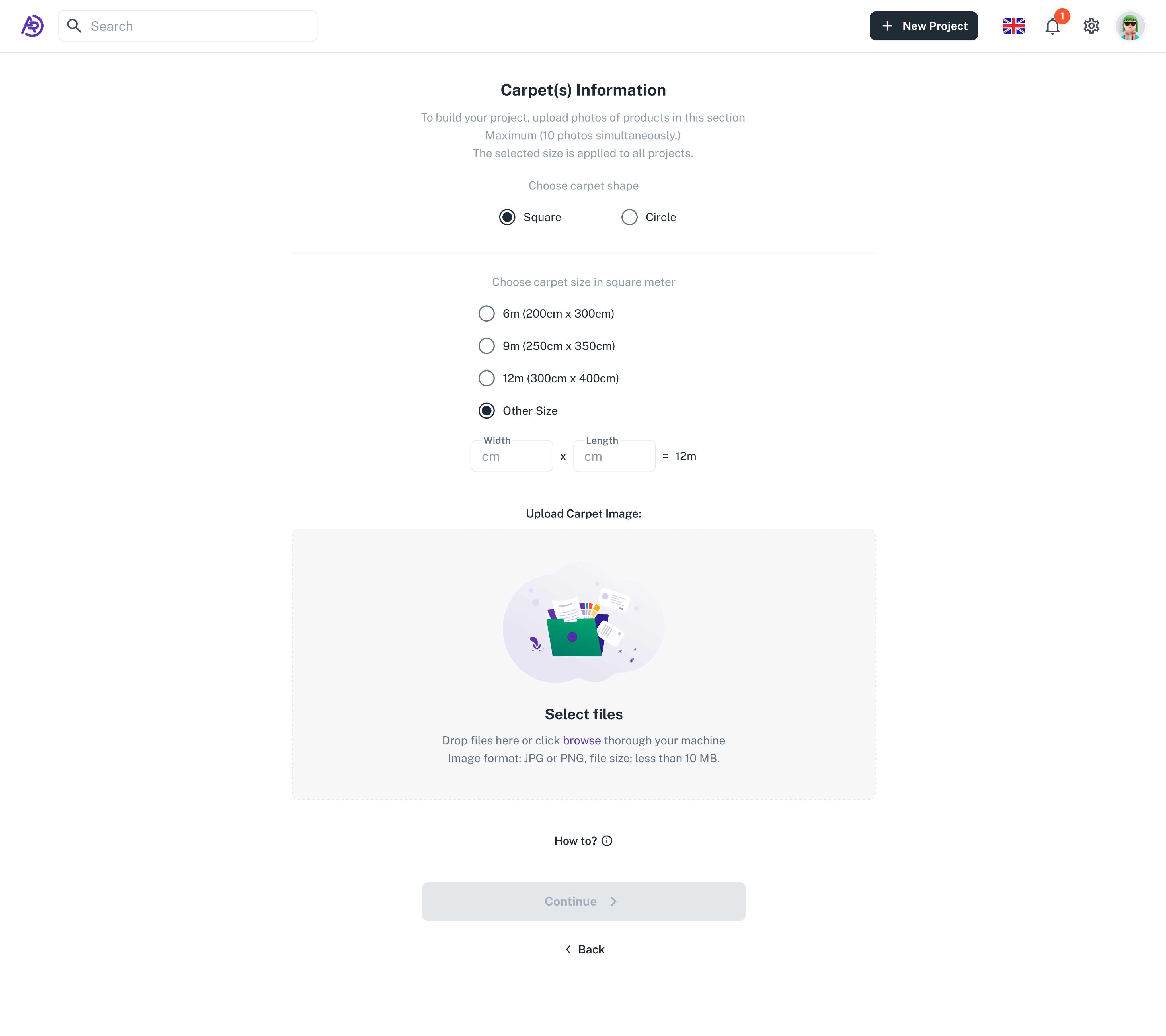
Carpet Information
This screen is part of the product setup flow for carpet retailers. It allows users to define the carpet’s shape, size, and dimensions before uploading their product images. The interface follows a step-by-step approach, minimizing user error and providing quick visual feedback for each selection.
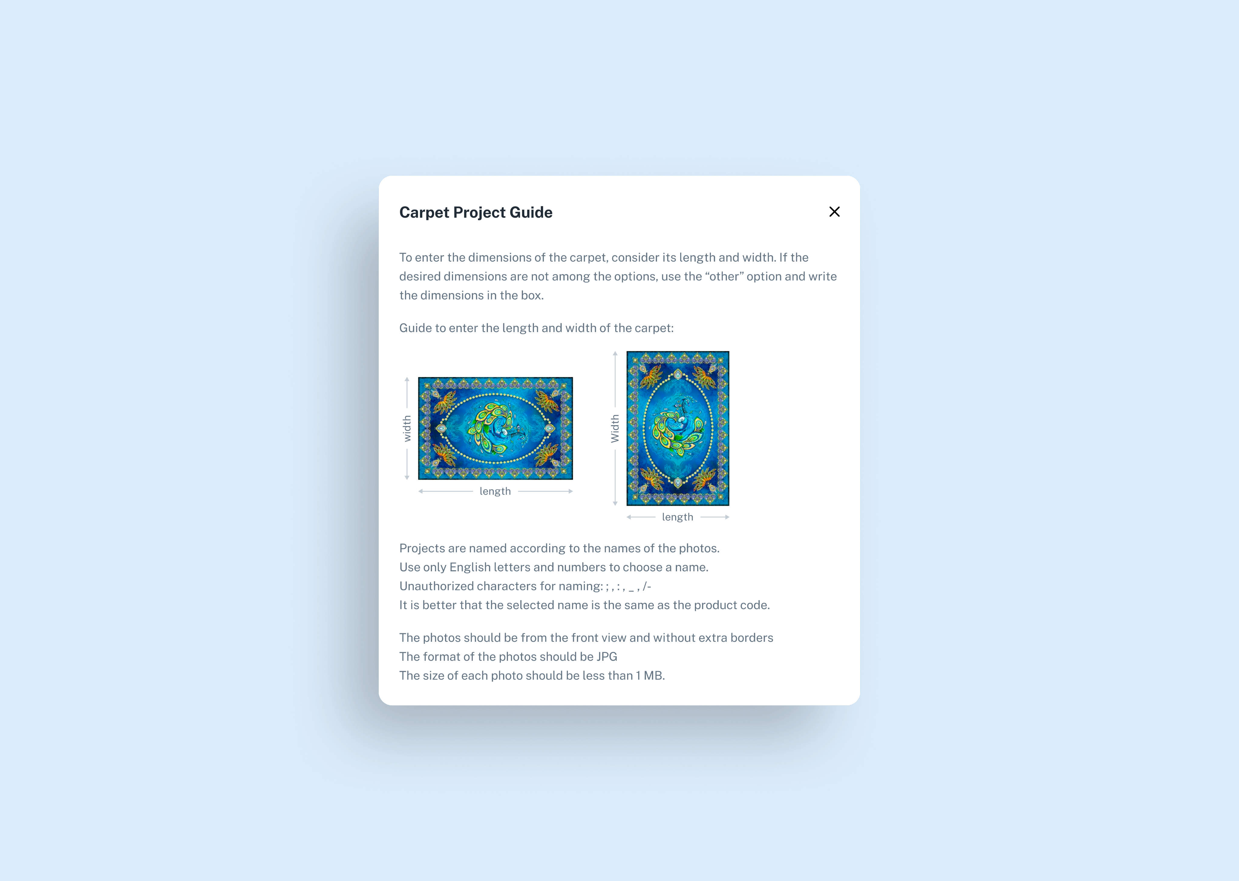
Carpet Project Guide
To support non-technical users, I designed a contextual guide explaining how to input dimensions and format photos correctly. This modal appears on demand and includes visual examples for better comprehension. It’s a small UX detail that significantly reduces support requests and user frustration.
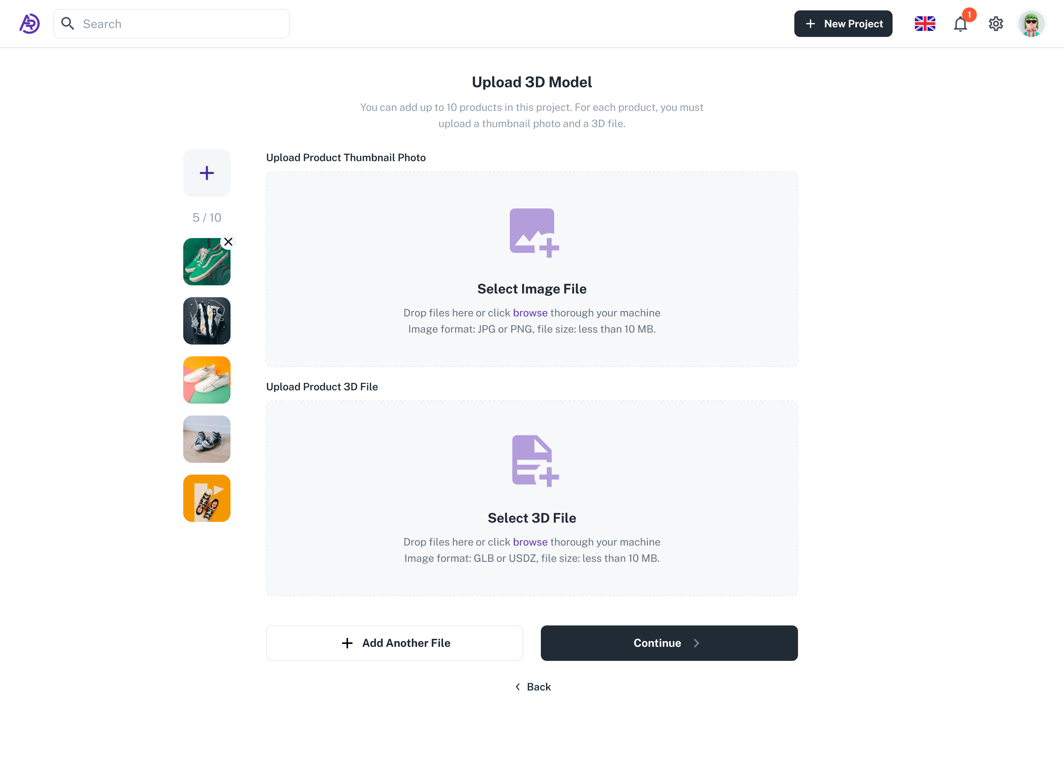
Upload 3D Model
This is the final and most technical step, where users upload both thumbnail images and 3D model files (GLB or USDZ). The design supports drag-and-drop functionality and batch uploads for up to ten products at once. The interface maintains a lightweight, distraction-free structure that aligns with ARmo’s goal of making advanced AR tools accessible to everyone.
Dashboard
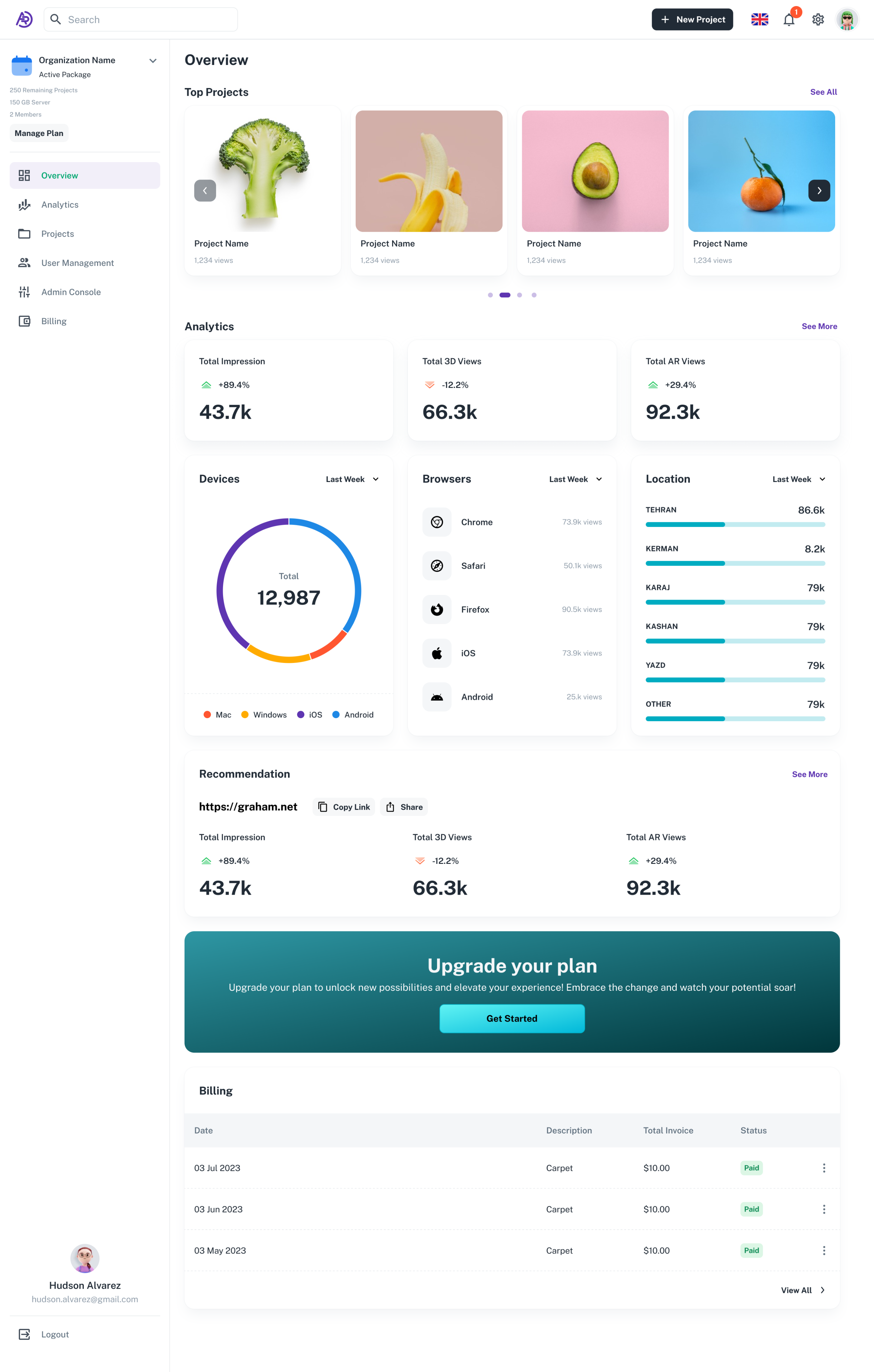
Dashboard Overview
The dashboard serves as the main hub where users can monitor their projects, performance metrics, and account status at a glance. The design focuses on clarity, modularity, and quick access — ensuring users can instantly understand how their AR campaigns are performing.
The top section highlights active projects with thumbnail previews, while the analytics panels summarize impressions, 3D views, and AR interactions in real time. Data visualizations are clean and lightweight, using soft color contrasts to support readability across devices.
Additional widgets like device and browser breakdowns, geographic insights, and billing history help business owners track engagement and usage without overwhelming them. The overall goal of this layout was to create a sense of control and transparency — making complex data approachable through thoughtful design.
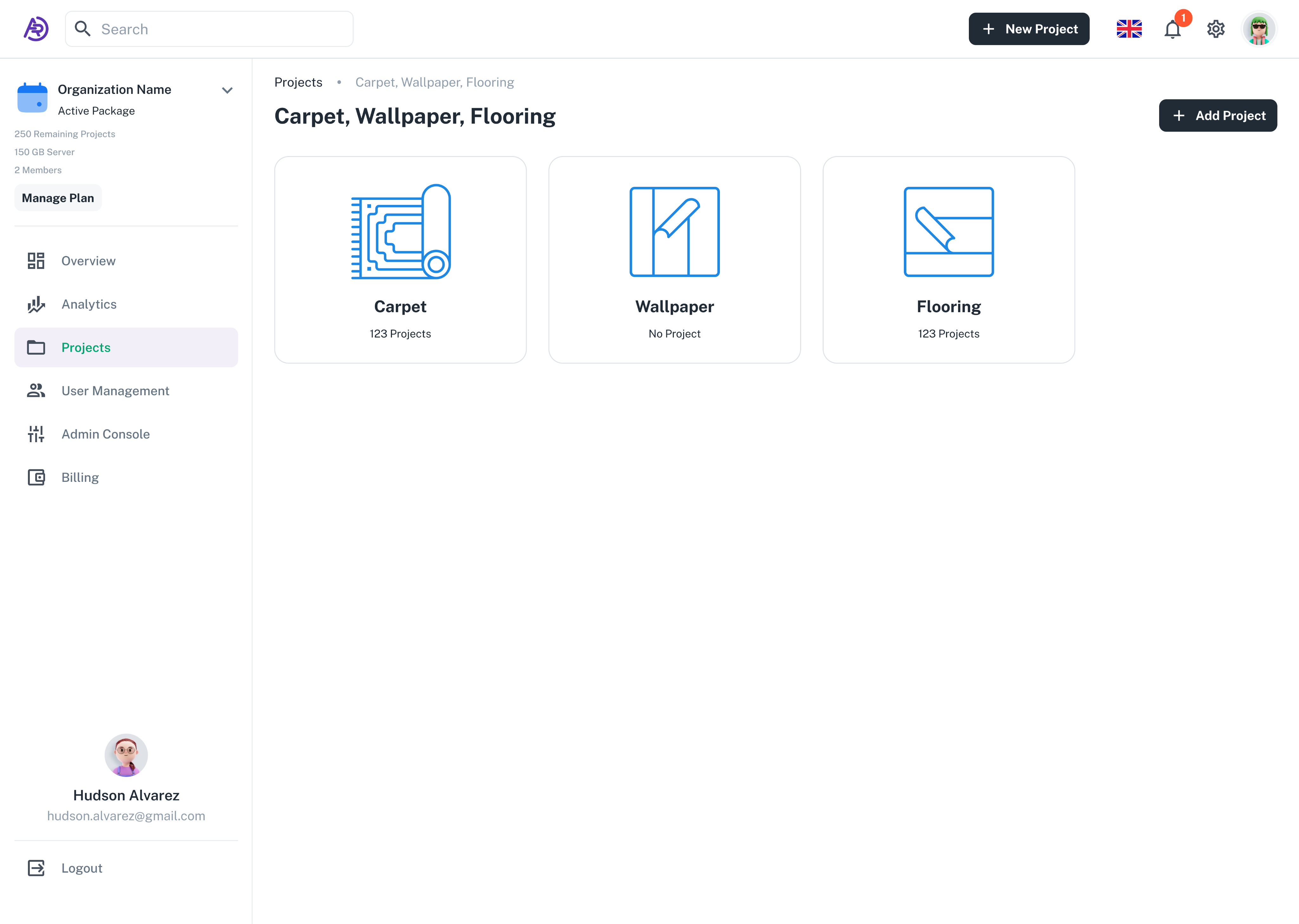
Projects Overview — Categories
This section presents all product categories within an organization, such as carpets, wallpapers, and flooring. The goal was to give users a clear structural overview of their projects through recognizable icons and consistent layouts. The interface emphasizes simplicity and clarity, helping users quickly locate and manage their AR assets with minimal navigation effort.
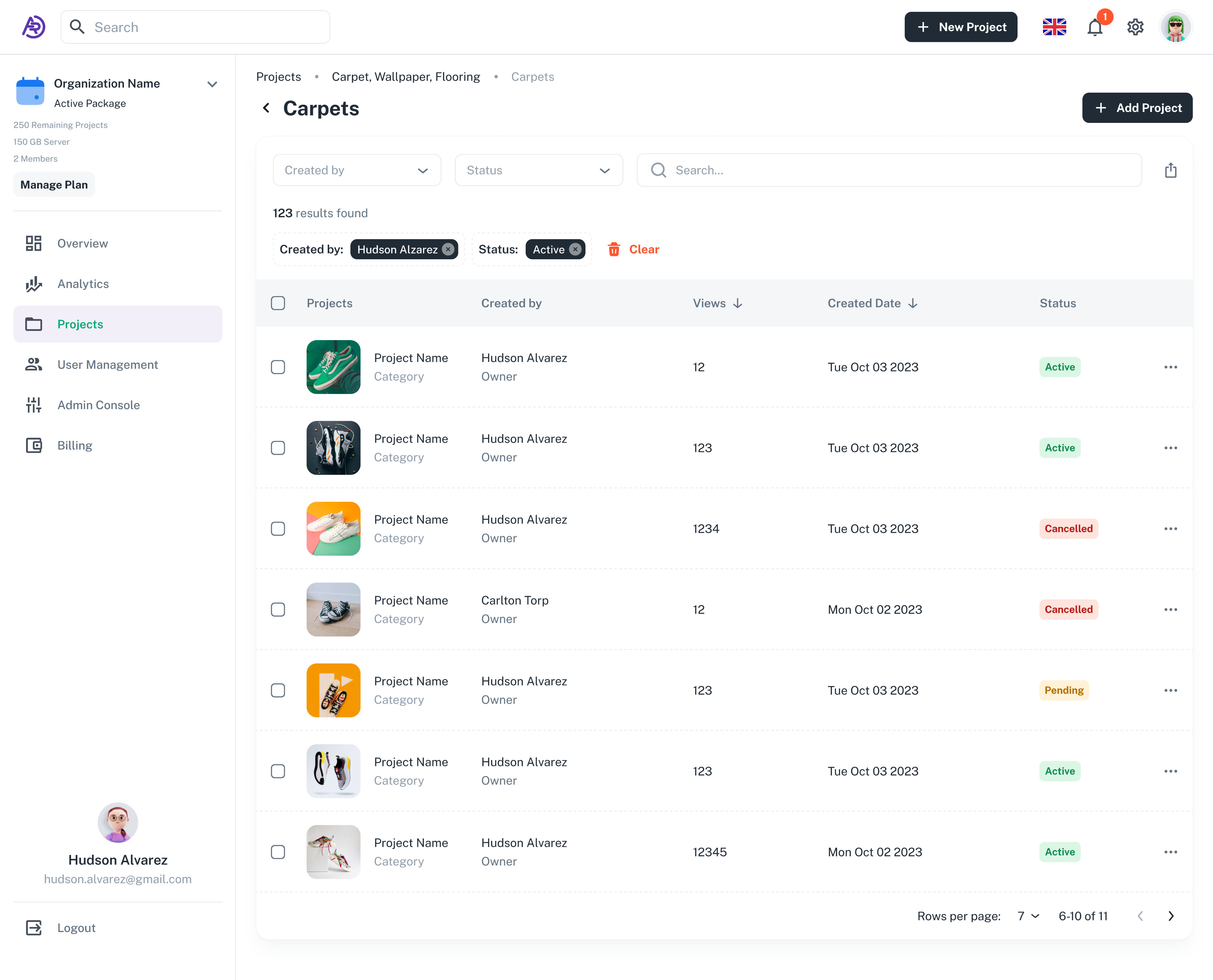
Filtered Projects List
Here, users can browse and manage all projects within a specific category. The table layout provides powerful filtering and sorting capabilities by creator, date, and status. Status indicators (Active, Pending, Cancelled) use color-coded tags to improve scanability, while thumbnails make it easy to visually identify each 3D project. This page was designed to balance functionality and cleanliness — keeping it data-heavy yet visually calm.
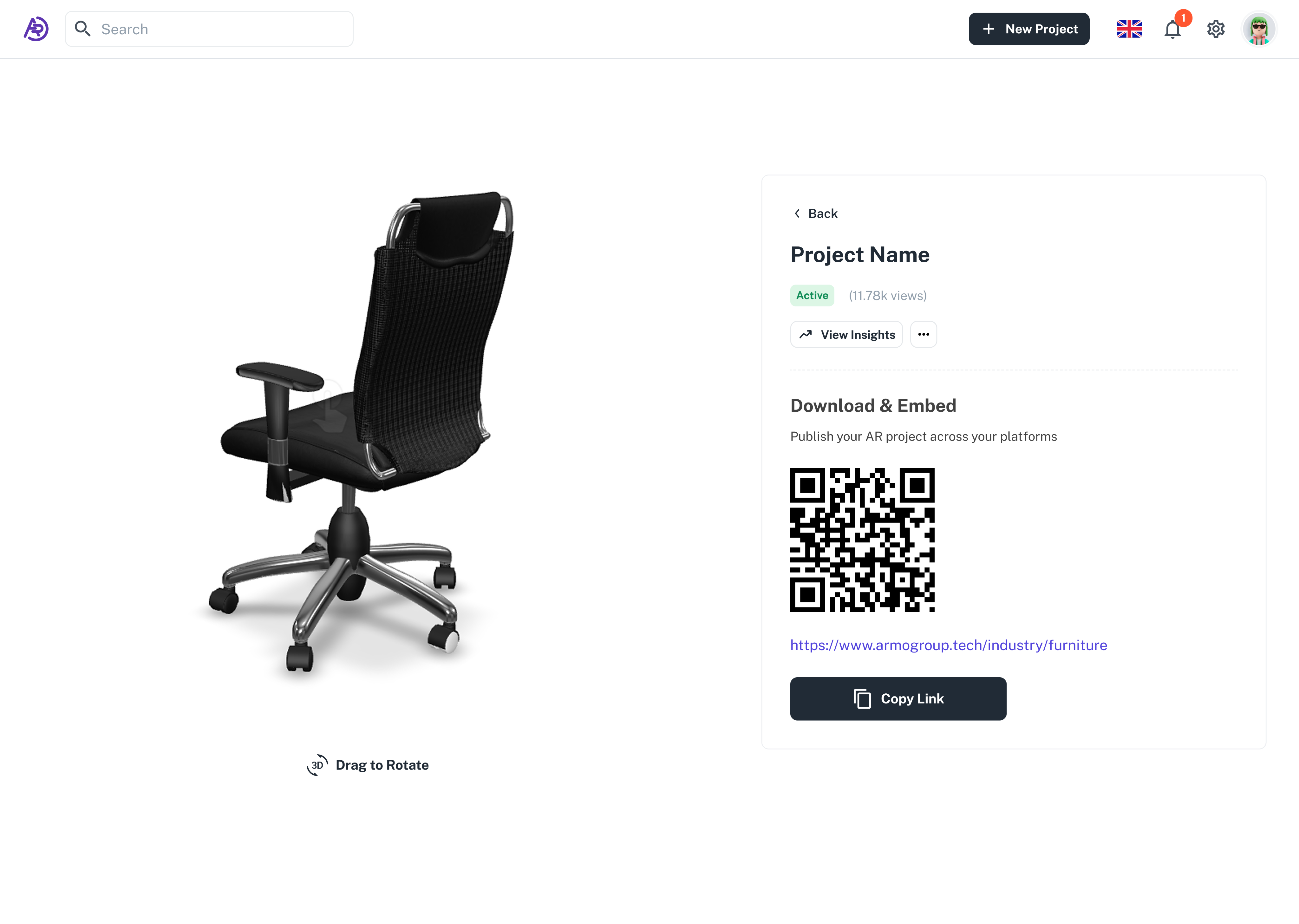
Project View Page
This screen is where users can preview and share their final 3D or AR project. It combines an interactive model viewer on the left with project metadata and publishing options on the right. Users can rotate the model in real time, view performance insights, and generate QR codes or shareable links to embed the experience on external platforms. The design maintains a minimalist structure that prioritizes focus on the 3D object, enhancing immersion and usability.
Reports and Analytics
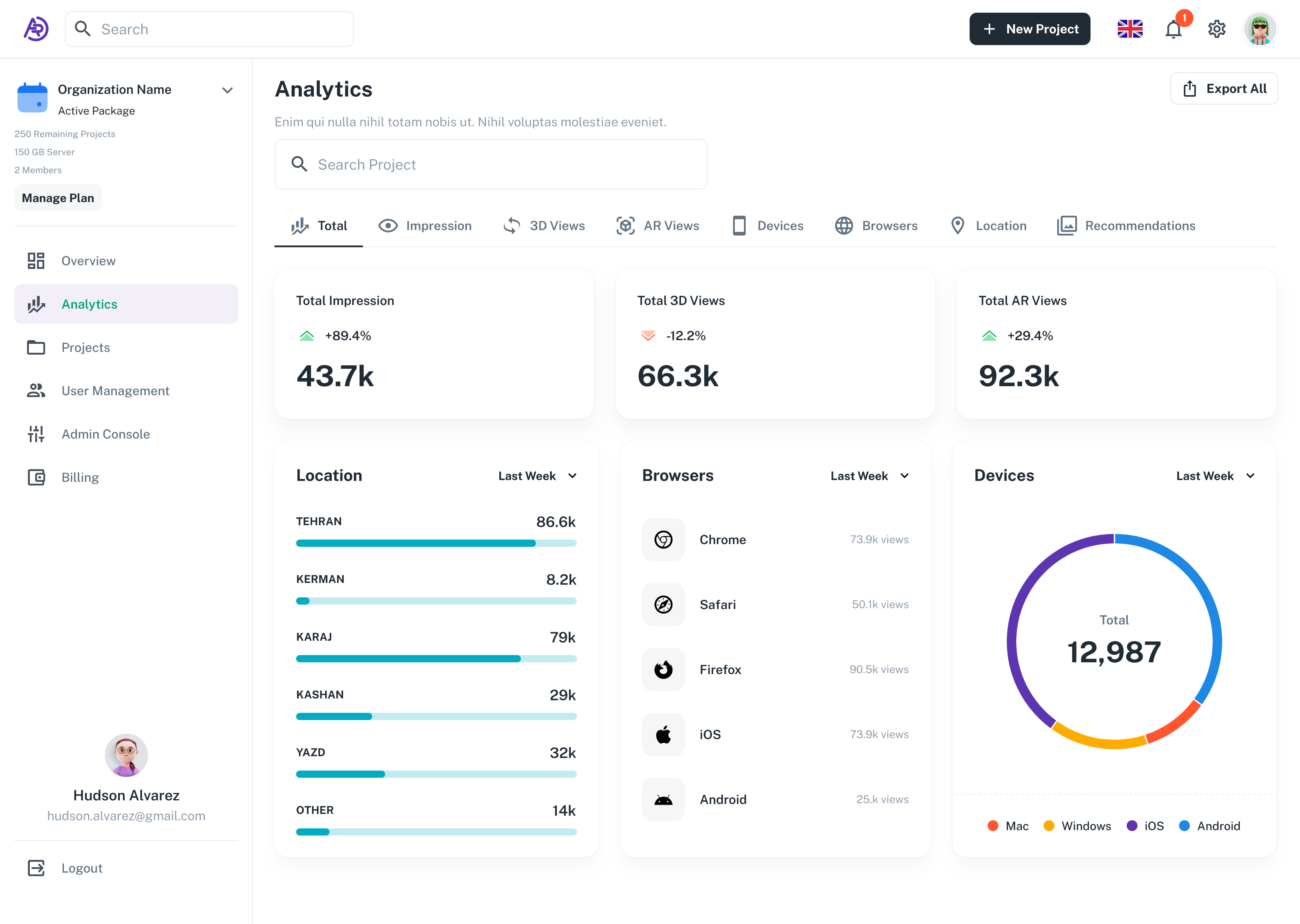
Analytics Overview
The Analytics section was designed to help users monitor their product performance with clarity and precision. It provides a high-level summary of total impressions, 3D views, AR interactions, and engagement trends, allowing businesses to measure the real impact of augmented reality on their sales. The modular structure makes each data set easily digestible while maintaining visual balance across charts and metrics.
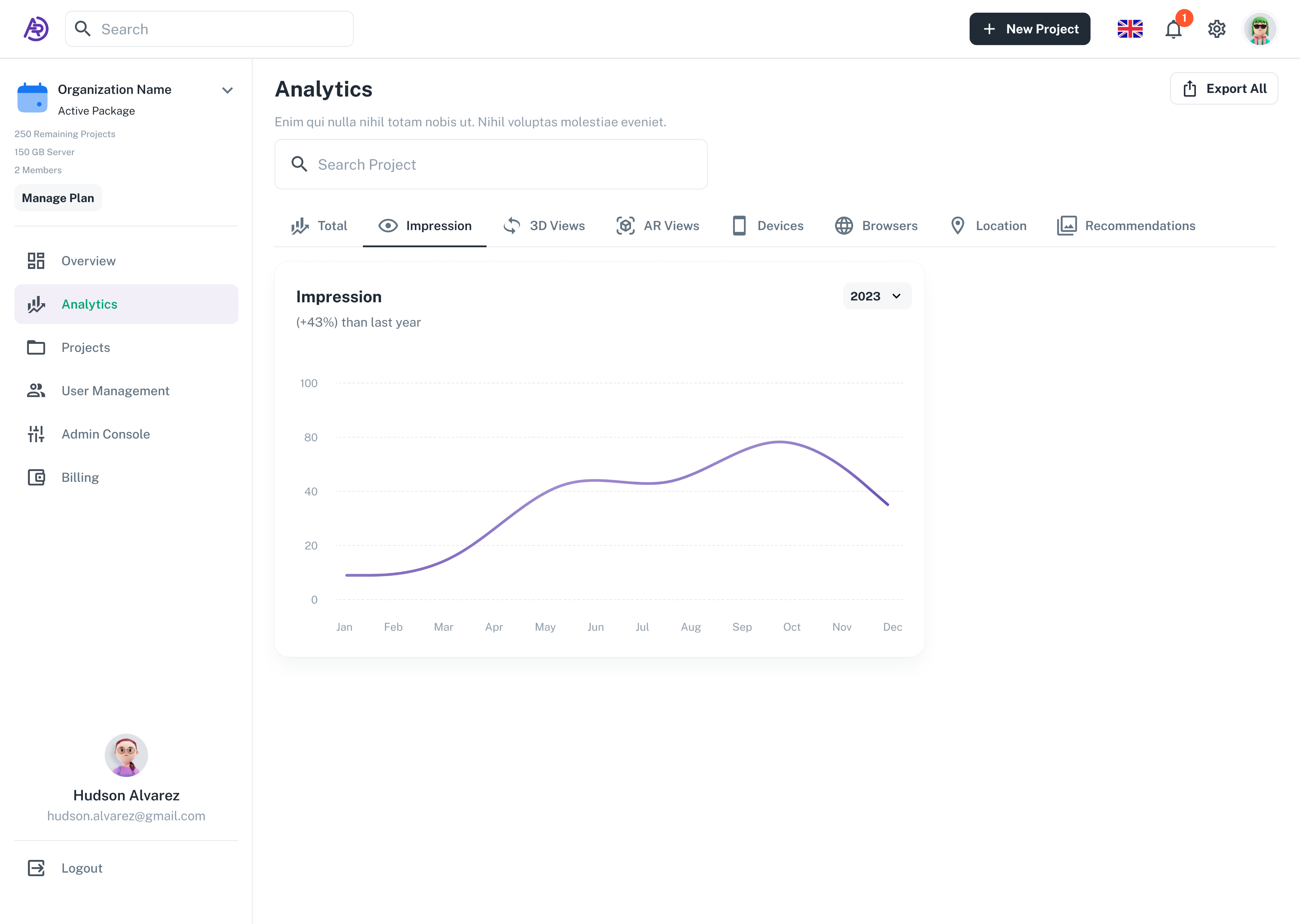
Impression Chart (Line Graph)
This view highlights growth trends over time. The soft line chart design and minimal axis labels ensure a clean, non-intrusive visual that lets the data stand out. The goal was to make insights intuitive — users can quickly recognize performance improvements, compare different time periods, and make data-driven marketing decisions.
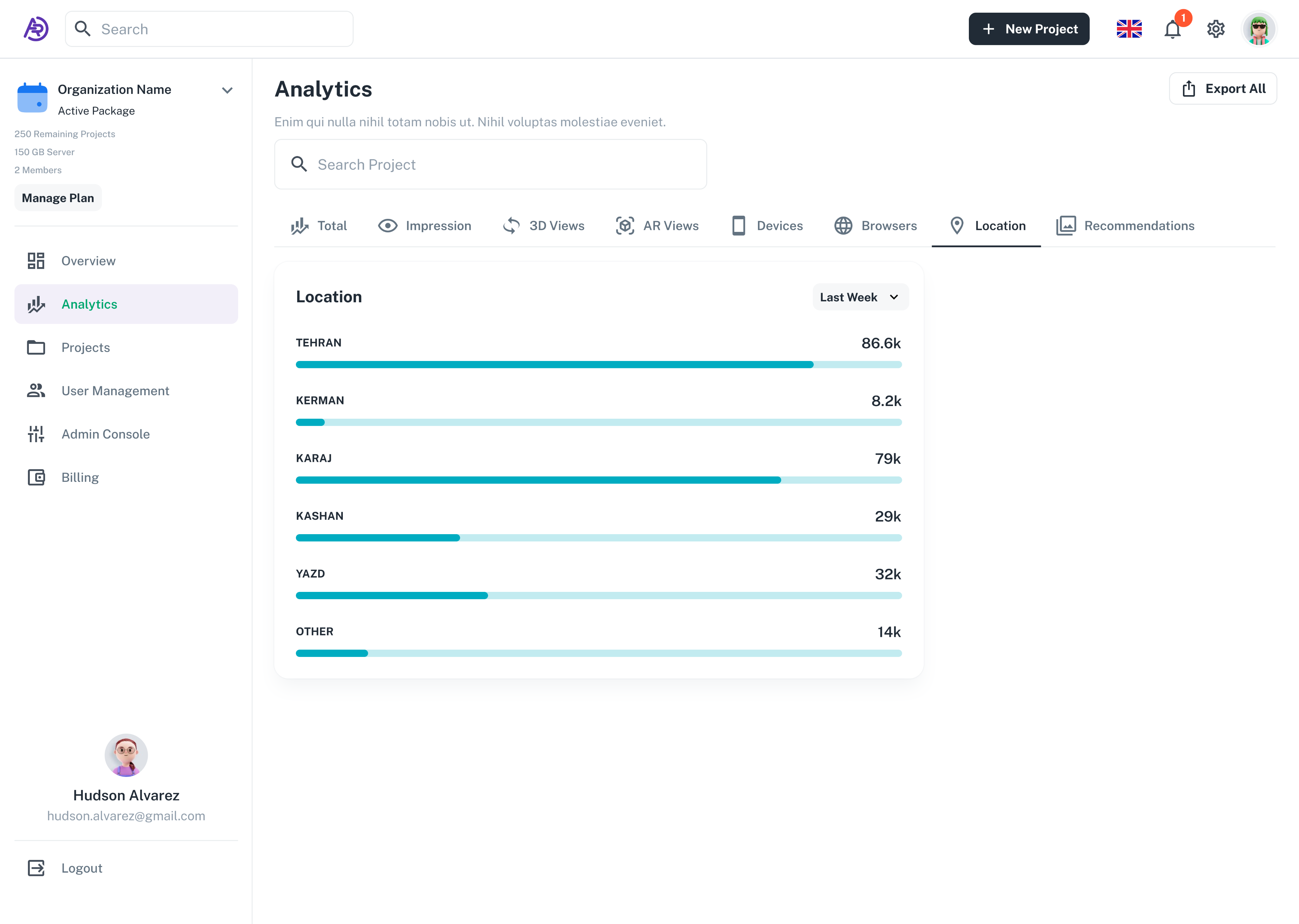
Location Insights (Bar Chart)
The location analytics page helps businesses see where their AR interactions are happening geographically. By visualizing activity by region, users can identify their strongest markets and tailor campaigns accordingly. Consistent colors and balanced spacing make the data easy to scan even at a glance.
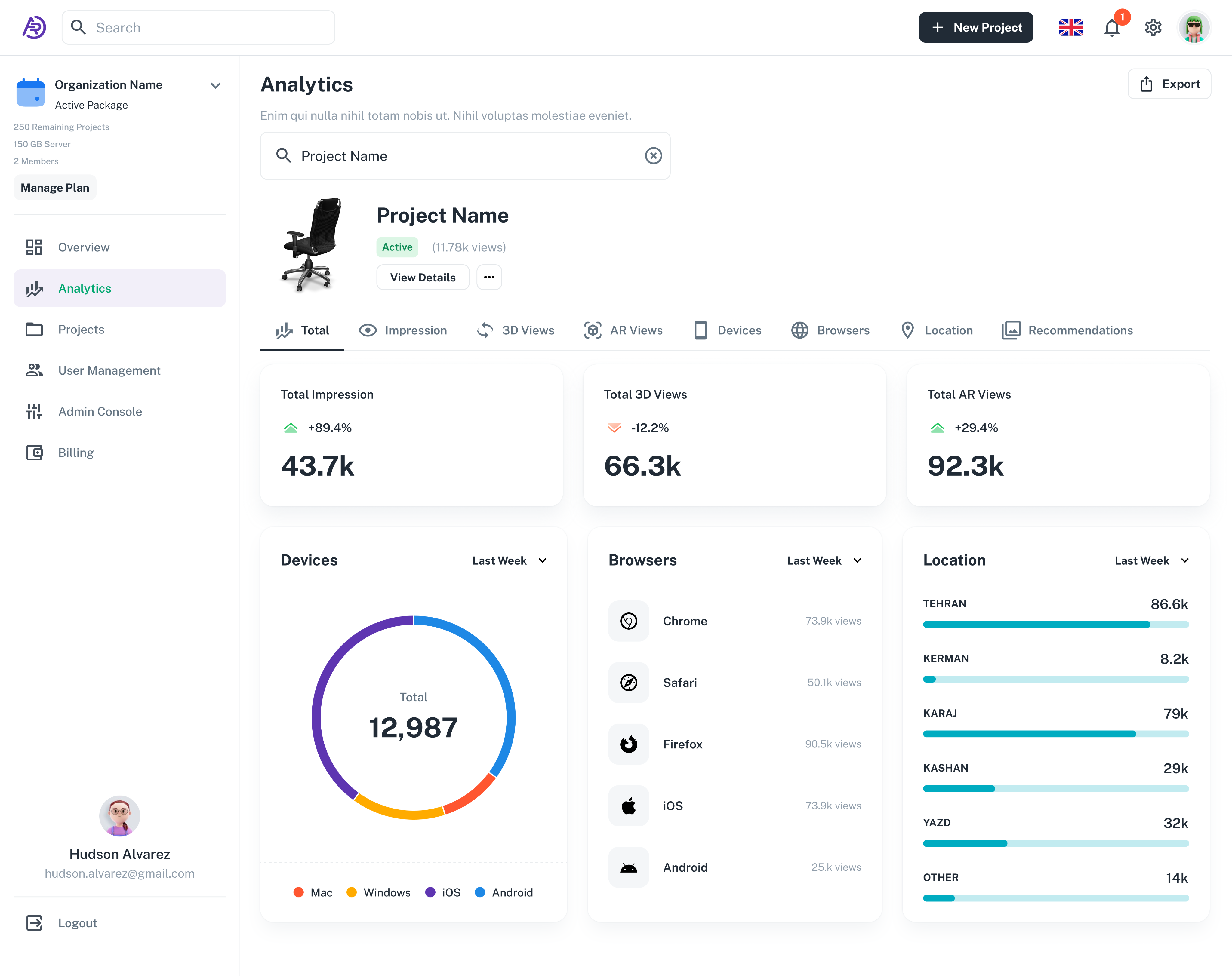
Project-Specific Analytics (Search Result)
Users can search for individual projects to view detailed performance breakdowns. This page combines key metrics — impressions, 3D views, AR usage, devices, browsers, and location — in one unified layout. The challenge here was to visualize multiple dimensions of data while keeping the interface lightweight and user-friendly.
Conclusion
Reflection & Learnings
Designing the ARmo platform was an opportunity to explore how augmented reality can reshape digital commerce. The main challenge was to make highly technical processes — like 3D model uploads, AR embedding, and analytics tracking — feel simple, intuitive, and accessible to non-technical users.
Through multiple iterations of interface design, user testing, and visual refinement, the platform evolved into a product that balances clarity, scalability, and brand consistency. Each part of the product, from onboarding and dashboard structure to analytics visualization, was crafted to communicate transparency and ease of control.
Working on ARmo deepened my understanding of how information hierarchy, semantic visual cues, and data visualization principles can transform complex systems into delightful user experiences. It also reinforced the importance of aligning design decisions with business strategy — ensuring that every interaction not only looks great but drives measurable impact.
This project remains one of my most comprehensive design experiences, combining UI/UX design, visual identity, and system thinking to create a cohesive digital ecosystem for AR-powered solutions.
Contact
I’m always excited to connect and explore new ideas.Let’s create something meaningful together.


© 2025 Sam Miri. All rights reserved.


3D Augmented
The Next Level for Your Business

Leading Design at ARmo — Building an AR Platform from the Ground Up
Introduction
ARmo is a pioneering AR/VR startup helping e-commerce businesses present their products in a truly interactive and realistic way. Our goal has always been to bridge the gap between how customers imagine a product and how they experience it in real life.
I’ve been part of ARmo since its early days — almost four years — leading everything related to design: from product and UX/UI to visual identity, marketing, and social media.
My Role and Responsibilities:As the Lead Product Designer, I was responsible for defining and shaping the entire design direction of the company.
My work included:
- UX & UI design for web and mobile platforms
- Creating and maintaining the brand identity and visual assets
- Designing marketing materials, landing pages, and social media content
- Collaborating with the CEO and CTO to define product strategy and roadmap
- Contributing to product management and feature definition from day one
Where Design Meets Reality
Designing for ARmo meant transforming imagination into interaction.
Working closely with our CEO and CTO, I defined the product’s structure, designed every screen, and built a consistent visual identity that connects brand and product.
What follows is a collection of key designs — from public-facing pages to in-product experiences — all reflecting one vision: making augmented reality feel effortless.
Landing Pages
Homepage
Introducing ARmo
The homepage was designed to introduce ARmo’s value proposition in a clear and visually immersive way.
The hero section highlights the core concept — bridging digital and physical worlds through augmented reality — with an interactive visual that immediately communicates the product’s purpose. Below, the “Try Now” and “Why AR?” sections guide visitors to understand how the platform works and the benefits of adopting AR in e-commerce.
The layout combines futuristic visuals, clean typography, and strategic contrast to reflect ARmo’s high-tech identity while maintaining usability and clarity.
AR Solution Landing Page
This page introduces ARmo’s core product offerings and demonstrates how augmented reality enhances online shopping across multiple industries.
The structure highlights the three main brand values — innovation, simplicity, and trust — while showcasing real-world use cases such as furniture, apparel, and home décor.
The visual rhythm alternates between large imagery and concise text blocks to maintain engagement and readability.
Carpet AR Landing Page
Focused on digital transformation for carpet retailers, this page demonstrates how AR visualization helps customers see textures and dimensions in their own spaces.
The design balances detailed explanations with visual hierarchy, keeping attention on the product experience.
Feature cards and statistics emphasize measurable benefits like reduced returns and increased conversion rates.
Eyewear Try-On Page
This page introduces ARmo’s virtual try-on solution for eyewear brands, designed to increase customer confidence and reduce product returns.
The hero section features a human-centered visual that instantly communicates the idea of trying before buying.
The layout follows a clean and modern grid with focus on conversion-oriented messaging and clear business benefits.
Virtual Makeup Landing Page
Aimed at the beauty and cosmetics industry, this page presents how ARmo’s technology enables users to virtually test makeup products in real time.
The tone is modern and aspirational, with a strong emphasis on personalization and user experience.
The “Why Armo?” and “Our Solutions” sections reinforce the company’s credibility and technical excellence through concise, visually guided storytelling.
Registration
Sign In Page
The sign-in screen was designed to make the first interaction feel simple and trustworthy. A clean layout, soft illustration, and minimal input fields guide users smoothly into the platform. The option to sign in with email or phone number ensures flexibility and accessibility for different user groups.
Email Login Flow
To simplify authentication, the login process uses a secure one-step verification code sent to the user’s email. This eliminates password complexity while keeping the process familiar and frictionless. The interface focuses on clarity and minimal visual noise, encouraging quick completion.
Add Organization
After signing in, users are guided to create their organization profile. This page helps personalize the experience by gathering essential information such as company name, industry, and size. The layout follows a form-driven design with clear hierarchy and strong focus on usability and readability.
Subscription / Choose Package
The subscription screen allows users to select the most suitable plan for their business needs. Pricing cards are visually consistent, with clear contrast and legible typography, making comparison easy. The design emphasizes transparency and trust by presenting all options upfront with simple call-to-actions.
Add Project
Choose Category
The first step of project creation helps users categorize their products easily. By using clear icons and a minimal layout, the page ensures that even first-time users can intuitively select the right product type (e.g., ring, necklace, accessories). The goal was to reduce cognitive load and make the onboarding process smooth and visually consistent.
Category Information
In this stage, users upload photos and metadata for their product. The form enforces simple rules for file naming and image format to ensure consistency across the platform. The layout emphasizes clarity and prevents errors through validation and helper text.
Carpet Information
This screen is part of the product setup flow for carpet retailers. It allows users to define the carpet’s shape, size, and dimensions before uploading their product images. The interface follows a step-by-step approach, minimizing user error and providing quick visual feedback for each selection.
Carpet Project Guide
To support non-technical users, I designed a contextual guide explaining how to input dimensions and format photos correctly. This modal appears on demand and includes visual examples for better comprehension. It’s a small UX detail that significantly reduces support requests and user frustration.
Upload 3D Model
This is the final and most technical step, where users upload both thumbnail images and 3D model files (GLB or USDZ). The design supports drag-and-drop functionality and batch uploads for up to ten products at once. The interface maintains a lightweight, distraction-free structure that aligns with ARmo’s goal of making advanced AR tools accessible to everyone.
Dashboard
Dashboard Overview
The dashboard serves as the main hub where users can monitor their projects, performance metrics, and account status at a glance. The design focuses on clarity, modularity, and quick access — ensuring users can instantly understand how their AR campaigns are performing.
The top section highlights active projects with thumbnail previews, while the analytics panels summarize impressions, 3D views, and AR interactions in real time. Data visualizations are clean and lightweight, using soft color contrasts to support readability across devices.
Additional widgets like device and browser breakdowns, geographic insights, and billing history help business owners track engagement and usage without overwhelming them. The overall goal of this layout was to create a sense of control and transparency — making complex data approachable through thoughtful design.
Projects Overview — Categories
This section presents all product categories within an organization, such as carpets, wallpapers, and flooring. The goal was to give users a clear structural overview of their projects through recognizable icons and consistent layouts. The interface emphasizes simplicity and clarity, helping users quickly locate and manage their AR assets with minimal navigation effort.
Filtered Projects List
Here, users can browse and manage all projects within a specific category. The table layout provides powerful filtering and sorting capabilities by creator, date, and status. Status indicators (Active, Pending, Cancelled) use color-coded tags to improve scanability, while thumbnails make it easy to visually identify each 3D project. This page was designed to balance functionality and cleanliness — keeping it data-heavy yet visually calm.
Project View Page
This screen is where users can preview and share their final 3D or AR project. It combines an interactive model viewer on the left with project metadata and publishing options on the right. Users can rotate the model in real time, view performance insights, and generate QR codes or shareable links to embed the experience on external platforms. The design maintains a minimalist structure that prioritizes focus on the 3D object, enhancing immersion and usability.
Reports and Analytics
Analytics Overview
The Analytics section was designed to help users monitor their product performance with clarity and precision. It provides a high-level summary of total impressions, 3D views, AR interactions, and engagement trends, allowing businesses to measure the real impact of augmented reality on their sales. The modular structure makes each data set easily digestible while maintaining visual balance across charts and metrics.
Impression Chart (Line Graph)
This view highlights growth trends over time. The soft line chart design and minimal axis labels ensure a clean, non-intrusive visual that lets the data stand out. The goal was to make insights intuitive — users can quickly recognize performance improvements, compare different time periods, and make data-driven marketing decisions.
Location Insights (Bar Chart)
The location analytics page helps businesses see where their AR interactions are happening geographically. By visualizing activity by region, users can identify their strongest markets and tailor campaigns accordingly. Consistent colors and balanced spacing make the data easy to scan even at a glance.
Project-Specific Analytics (Search Result)
Users can search for individual projects to view detailed performance breakdowns. This page combines key metrics — impressions, 3D views, AR usage, devices, browsers, and location — in one unified layout. The challenge here was to visualize multiple dimensions of data while keeping the interface lightweight and user-friendly.
Conclusion
Reflection & Learnings
Designing the ARmo platform was an opportunity to explore how augmented reality can reshape digital commerce. The main challenge was to make highly technical processes — like 3D model uploads, AR embedding, and analytics tracking — feel simple, intuitive, and accessible to non-technical users.
Through multiple iterations of interface design, user testing, and visual refinement, the platform evolved into a product that balances clarity, scalability, and brand consistency. Each part of the product, from onboarding and dashboard structure to analytics visualization, was crafted to communicate transparency and ease of control.
Working on ARmo deepened my understanding of how information hierarchy, semantic visual cues, and data visualization principles can transform complex systems into delightful user experiences. It also reinforced the importance of aligning design decisions with business strategy — ensuring that every interaction not only looks great but drives measurable impact.
This project remains one of my most comprehensive design experiences, combining UI/UX design, visual identity, and system thinking to create a cohesive digital ecosystem for AR-powered solutions.
Contact
I’m always excited to connect and explore new ideas.Let’s create something meaningful together.
© 2025 Sam Miri. All rights reserved.